Innovatrics Brand Guidelines
Version 1.0
Innovatrics Brand Guidelines
Version 1.0
Updated 2022/04/27
This is a visual identity manual of the Innovatrics brand. Its purpose is to ensure that the visual communication of the brand is consistent across all the online and offline channels. It serves as a guideline for employees of Innovatrics as well as all the external suppliers. Anyone contributing to the preparation of the visual materials must comply with the rules introduced in these guidelines.
Like the brand, the manual itself needs to be regularly updated and adapted to new needs to fulfill its function as a tool for creating new or modifying existing visual formats in the long term.
The manual was prepared by Milk Studio.
Here is an overview of the individual elements that make up our brand. Think of them as tools in your brand toolkit.
Logo
Our logo is the primary expression of our brand. It should feature prominently in all internal and external communications.

Colors
Color plays an important role in brand recognition. We have selected a set of primary and secondary Innovatrics colors.
Typeface
The primary brand typeface is Montserrat. It helps to strengthen the brands look and feel and to express the brand’s personality.

Visual and illustrative style
The visual and illustrative style can be used to deliver immediate impact by separating the logo and placing it as a dynamic element within the layout of the design.
Updated 2026/03/31
Our logo is our corporate signature, indicating ownership and endorsement. The position of the three dots is fixed. It can be changed only when the logo is animated. To be effective, the Innovatrics logotype must be presented and displayed correctly.
We use the logo wherever possible, exclusively in the form as described in this manual.
When working with the logo, we always use only the original variants from the Download section.
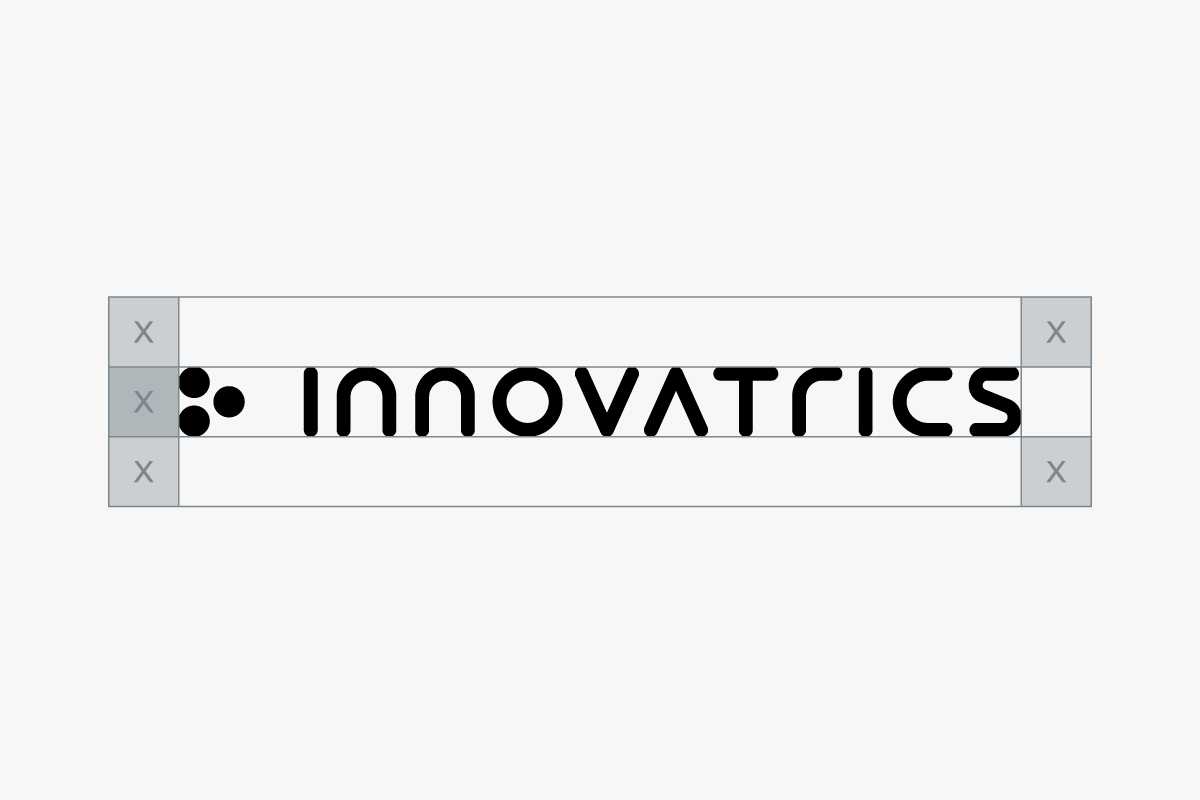
This logotype below is the primary logo of Innovatrics.
Other ways of using our logo are described below. Based on the type of communication, the correct version of the logo should be chosen. For an overview of logo usage, take a look at this section.

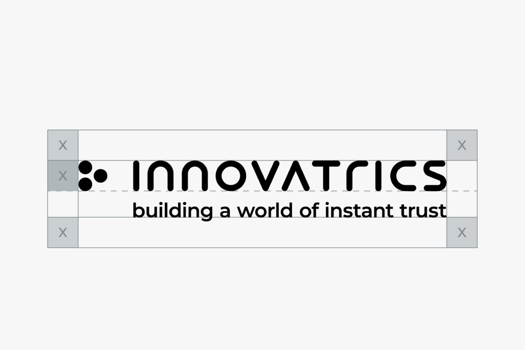
Logo with strapline is used outside the company Innovatrics(on external communication materials and on large areas).It does not have to be used on internal materials (e.g.corporate brochure).
The wordmark should be used when the legibility of the primary logo cannot be used due to the scale of usage and also when there are other brand assets elements already in use.
Our strapline may be used indendently as long as the logo is also present on the format.
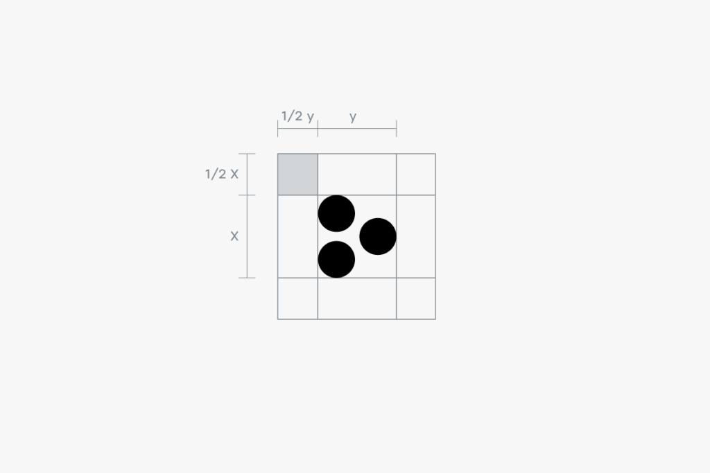
The symbol can be used independently, as long as the logo is present nearby. Position of the three dots is fixed.
The clear space is the zone around the logo which must not be interfered by any other element. This zone is determined by the “x-height”, which is a typographic unit that is measured from the baseline to the mean line.

It is important that all parts of our identity can be easily read in every application. For this reason, the logo should not be reproduced smaller than the sizes specified below. There are no maximum size restrictions as long as the clear space requirements are met.

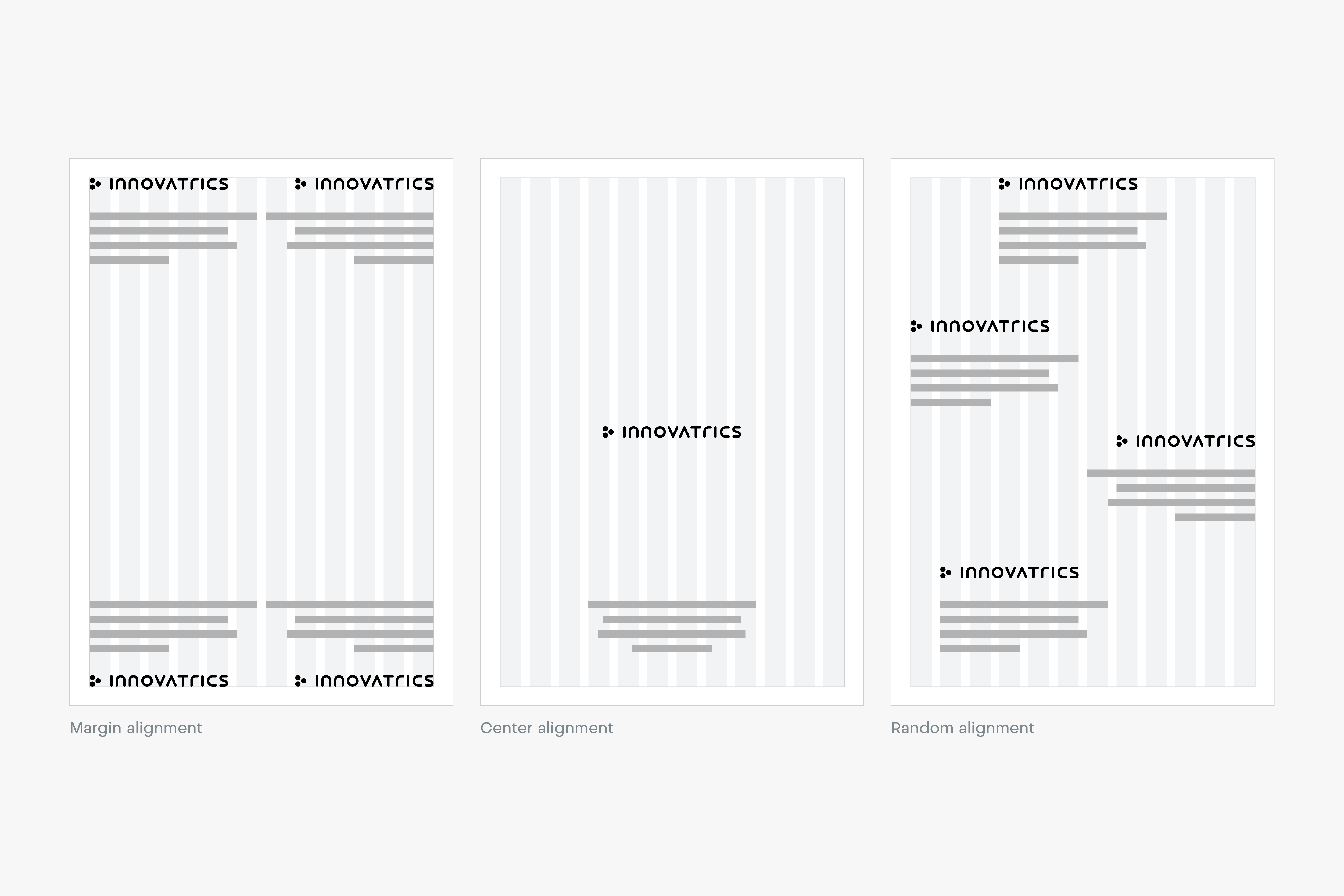
The primary position for our wordmark is the top left or bottom left corner, locked to the margin. However, our wordmark position is flexible and can respond to the content of the application. Below are examples of alternative positions for our wordmark.
The Dark Blue logo should always be the first first choice for any design. In case, when this is not possible, other options (Light Blue, Black or Grey) can be used.


Light Blue logo on Dark Blue background, should always be our first choice for any background-required design. In case, when this is not possible, other options (Light Blue, Black or Grey) can be used, to enhance the diversity of our brand.


Our logo should always be the most vital and visible element of our communications. When working with photography, the color and placement of the logo should always be considered carefully. Always chose backgrounds with plenty of contrast and simple forms to increase logo’s legibility.

Any misuse or alteration of our logotype affects the integrity of our brand. Please always use approved logomark artwork to ensure design consistency.


Bringing motion to our brand is vital and enhances the progressive essence of our brand.

Updated 2022/04/27
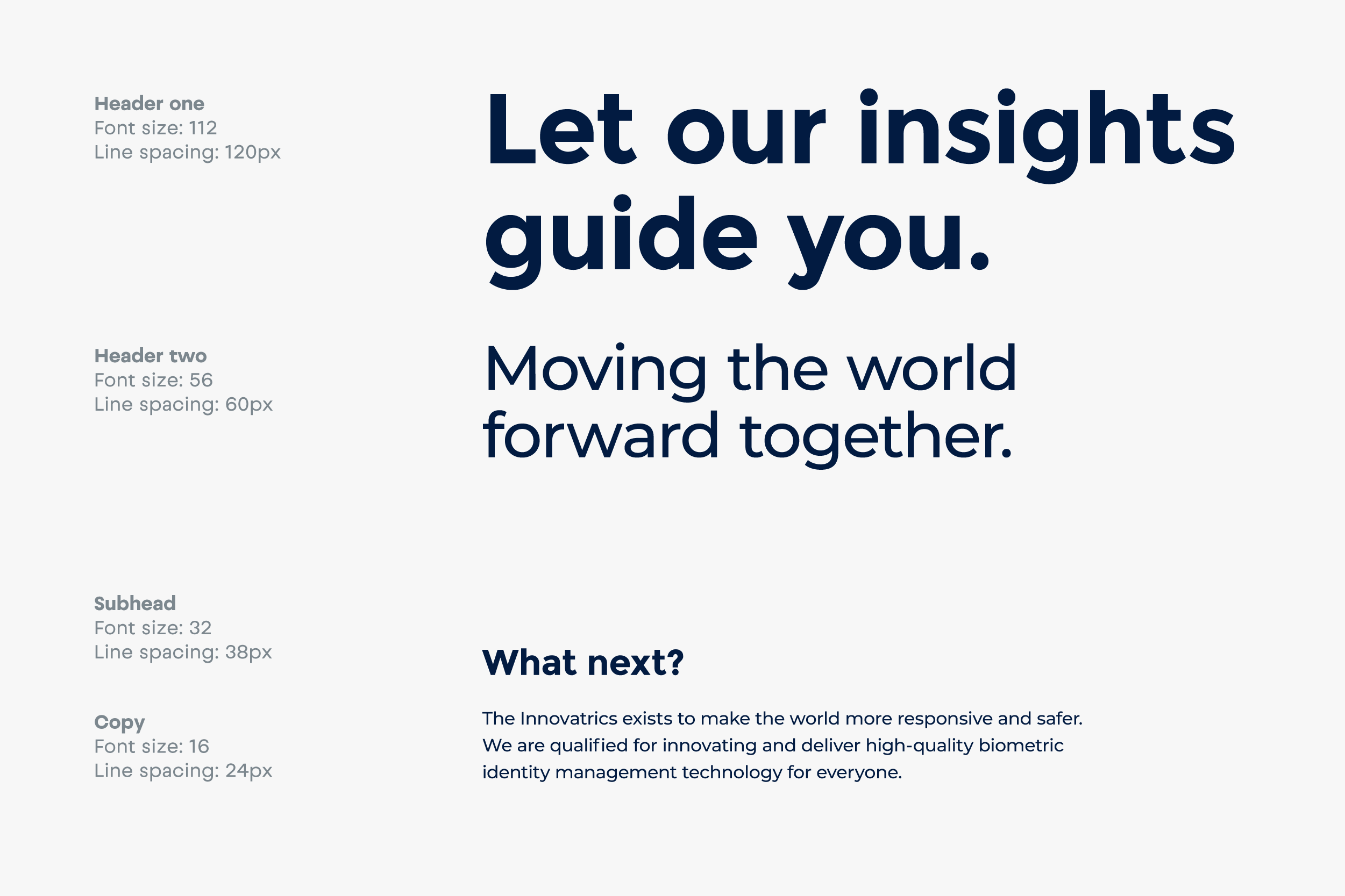
Our typography is clean, simple and elegant. It is designed to work well across all our communication channels both online and offline.
The primary brand typeface is Montserrat. It works to strengthen the brands look and feel and to express the personality of Innovatrics. We use it for both headline and copy texts.
Montserrat is an open source typeface, available for download on this link.

It is important to organize typography in a hierarchical system according to relative importance or inclusiveness through scale and function depending on communication.
In open e-mail communication, the brand type must be replaced with a font that is compatible with the fonts widely available to users on different devices and platforms. Typically, it is a Helvetica font (Mac), or Arial (Windows).

Updated 2022/04/27
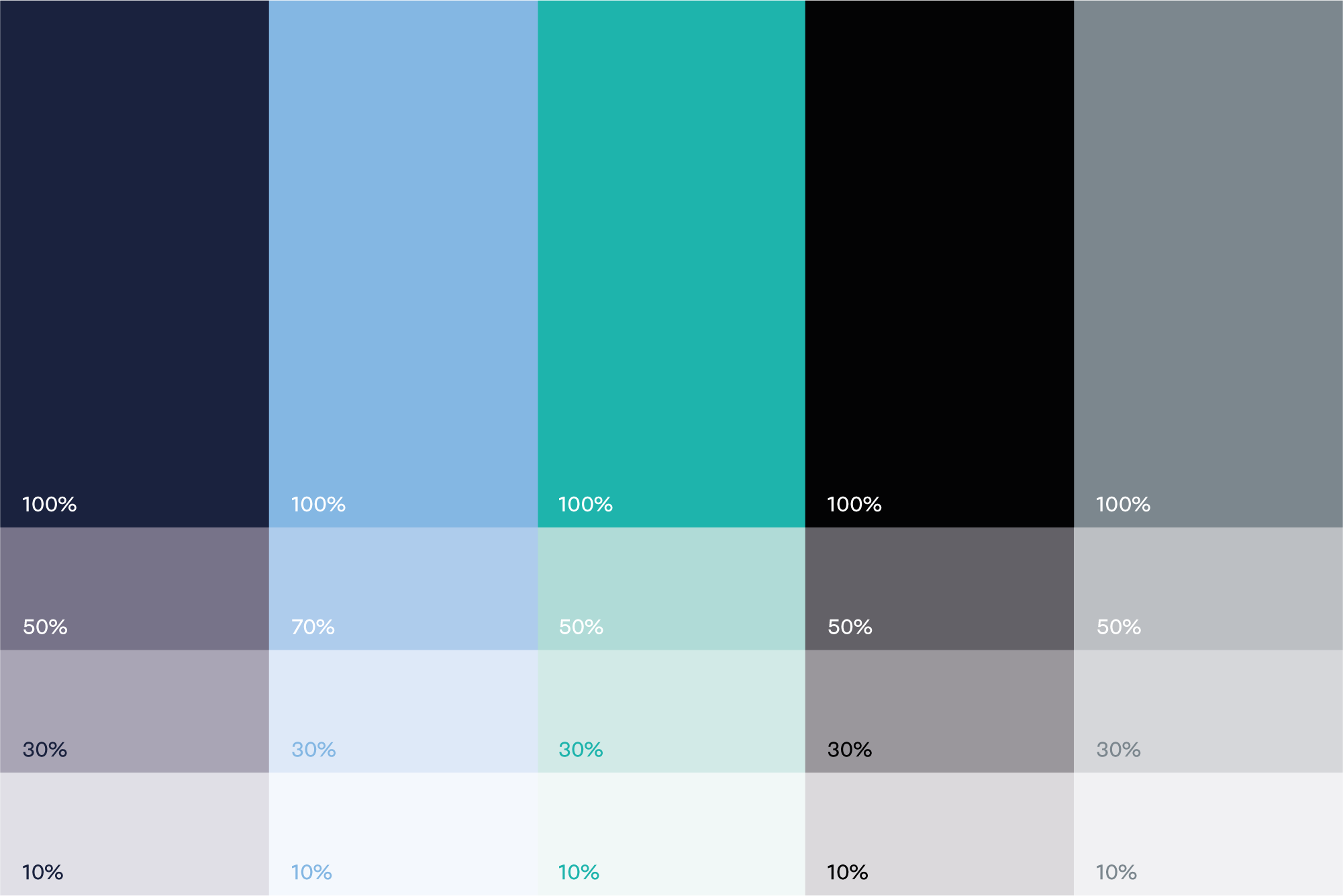
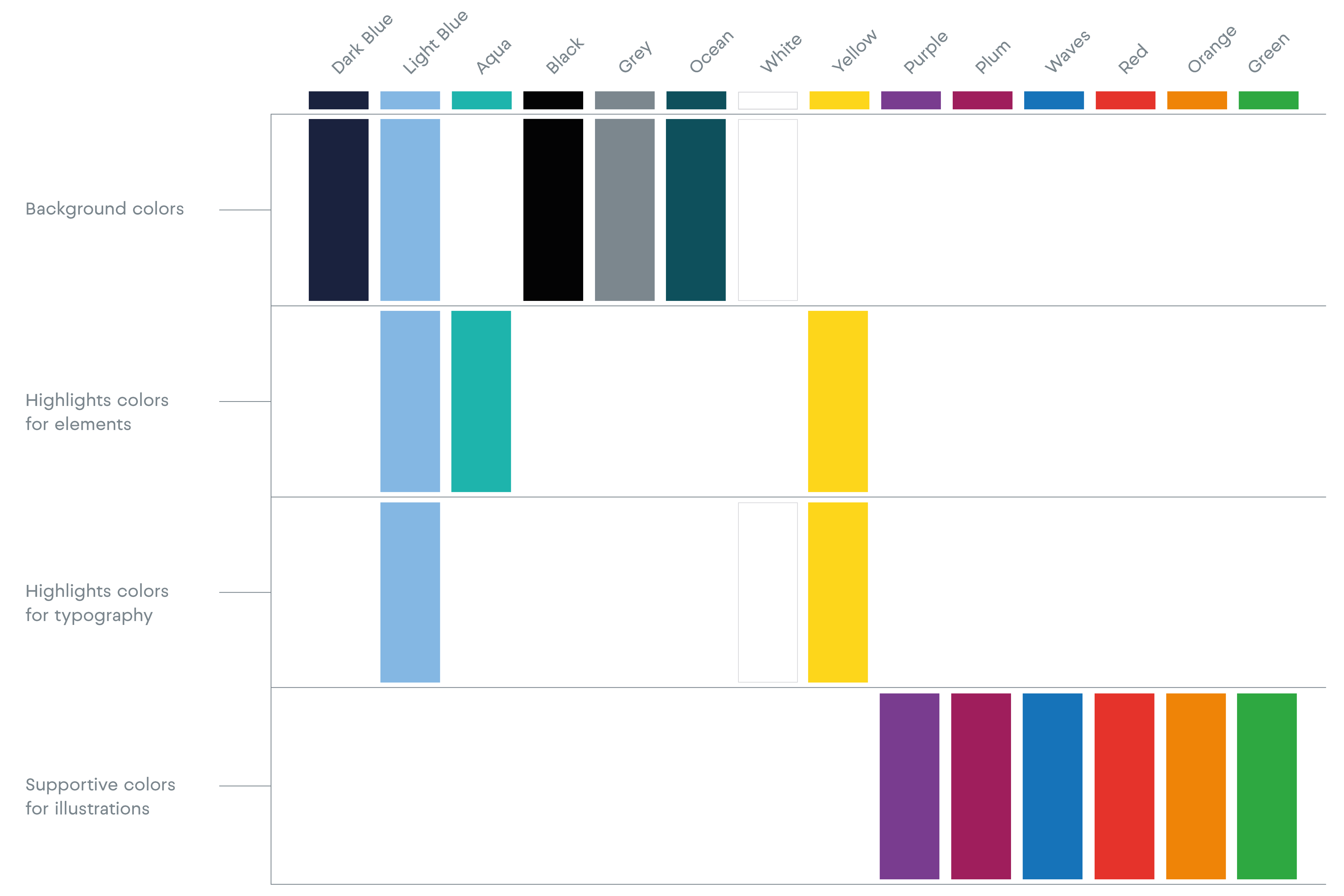
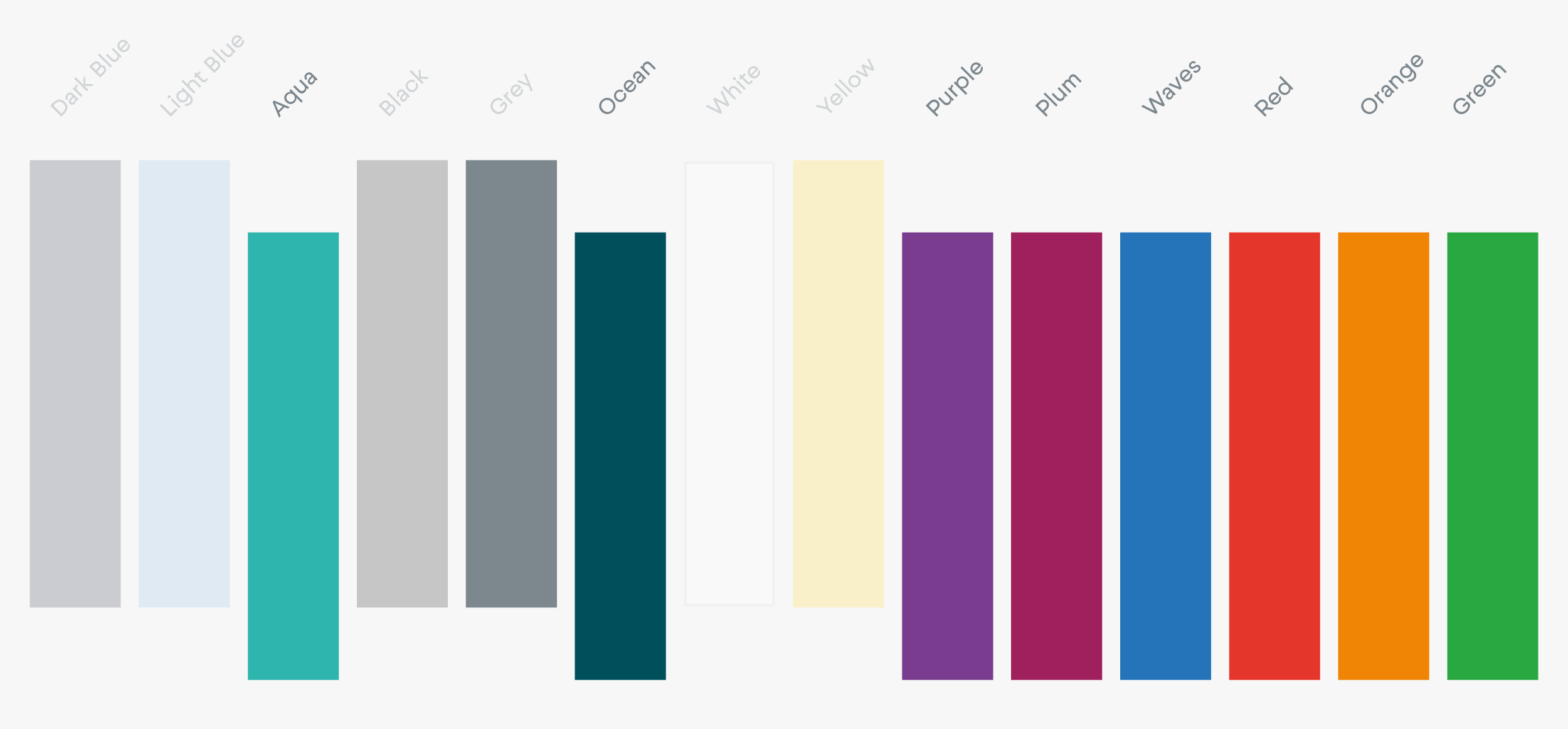
The use of color is an important aspect of the Innovatrics identity. Therefore, always use the exact color values listed to keep the brand consistent.

Our primary colors are Dark Blue, Light Blue, Black, Grey and Aqua as accent color.

Dark Blue
RGB — 2 27 65
CMYK — 100 76 12 68
HEX — 021B41
Pantone — 289C

Light Blue
RGB — 133 183 226
CMYK — 54 11 1 0
HEX — 85B7E2
Pantone — 291C

Aqua
RGB — 0 191 178
CMYK — 81 0 40 0
HEX — 00BFB2
Pantone — 3262C

Grey
RGB — 124 135 142
CMYK — 50 34 27 11
HEX — 7C878E
Pantone — 430C

Black
RGB — 19 19 19
CMYK — 0 0 0 100
HEX — 131313
Pantone — Black
We can work with our primary colors by using different opacity. They may be used like this in accents in our designs.
The secondary colors are complementary to our primary colors. Secondary colors should be used sparingly in details or accents (e.g. case studies, illustrations, occasional social media posts, icons, brand patterns, or other details on our website).

Green
RGB — 0 175 62
CMYK — 100 0 100 0
HEX — 00AF3E
Pantone — 360C

Orange
RGB — 239 144 32
CMYK — 0 53 100 0
HEX — EF9020
Pantone — 137C

Red
RGB — 229 53 43
CMYK — 0 91 87 0
HEX — E5352B
Pantone — 485C

Yellow
RGB — 255 214 22
CMYK — 0 18 100 0
HEX — FFD616
Pantone — 108C

Purple
RGB — 128 55 155
CMYK — 67 92 0 0
HEX — 80379B
Pantone — 2593C

Plum
RGB — 159 31 92
CMYK — 23 100 44 4
HEX — 9F1F5C
Pantone — 360C

Waves
RGB — 0 120 210
CMYK — 100 35 0 0
HEX — 0078D2
Pantone — 2778C

Ocean
RGB — 0 80 92
CMYK — 100 17 33 66
HEX — 00505C
Pantone — 3165C
We can work with our secondary colors by using different opacity. They may be used like this in accents in our designs.
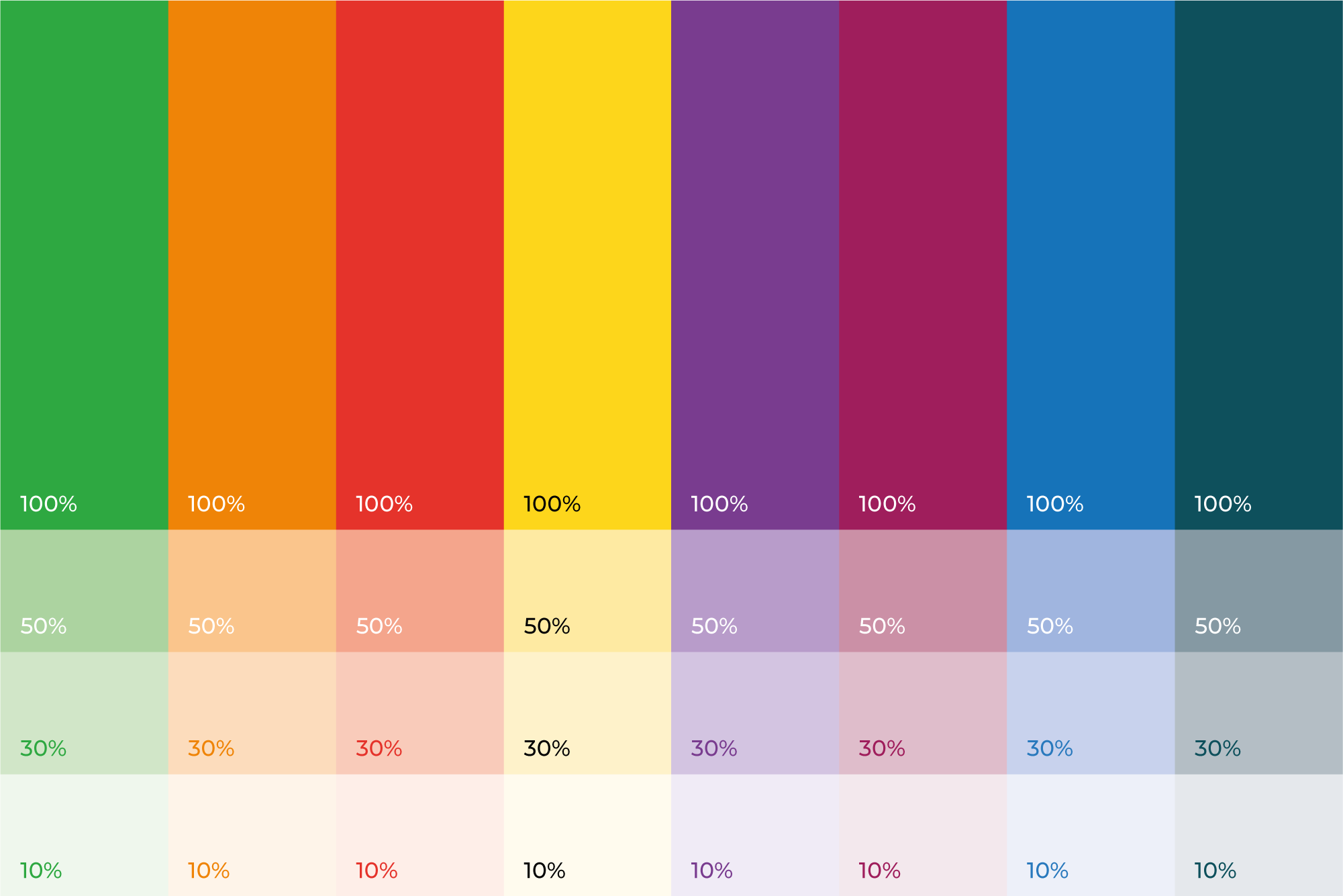
These examples should be used as a guide for selecting the correct option (Black or White) for your background.
Following chart is showing which colors to use for which purpose.
The color palette is set to help communicate different moods. Below are the examples of how to combine the colors.
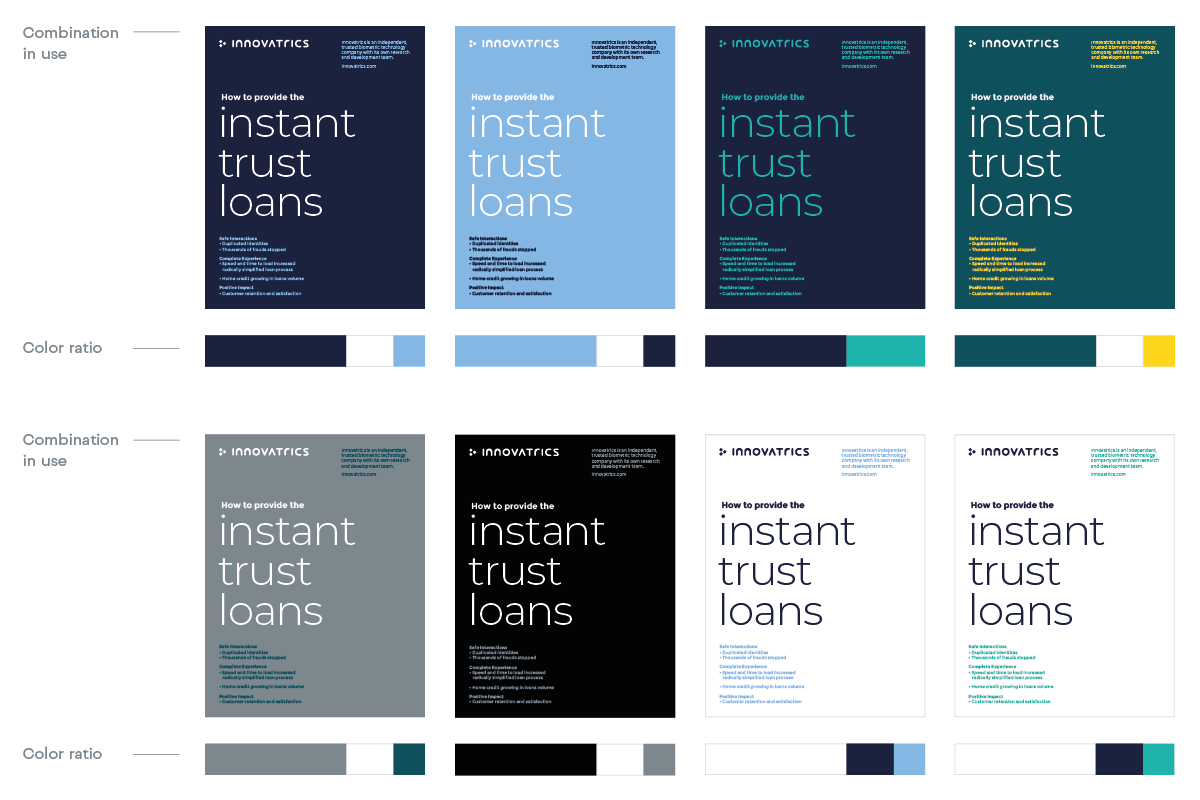
To ensure information and data are communicated clearly and concisely, you need to select the most appropriate colors, thus don’t hesitate to combine our primary and secondary color palettes. Infographic colors should match the colors of the document you are designing.
Updated 2026/03/31
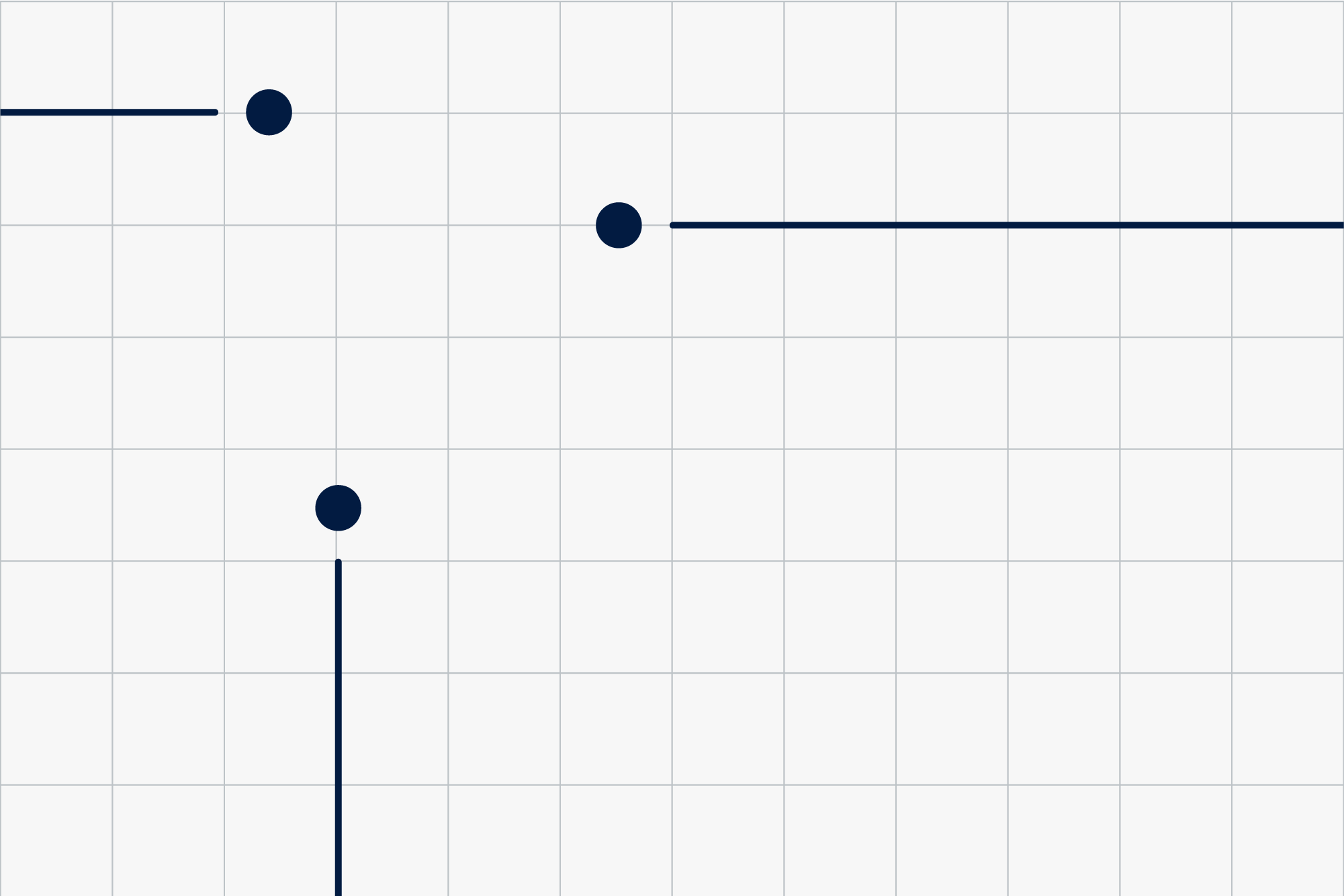
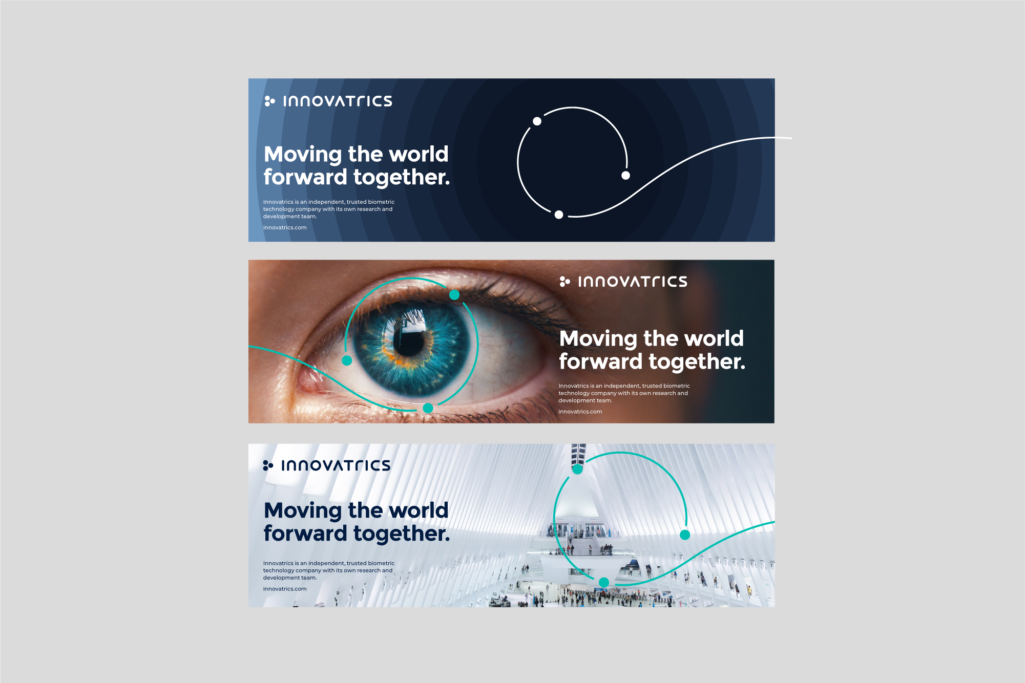
Our key visual vehicle (the circle) is a representation our brands‘ promise – Instant Trust. Usage of Instant Trust circle is vital in our branding.
The purpose of a circle is to draw attention to certain information or photography. The combinations and visual creations that consist of these elements can be used to explain products or company activities.
The element is always made of 3 dots connected by a spiral shape. The visual style is flexible enough in colour usage within set colour palette.

These are the possible options for placing the element on format. The element should always be used in positions as shown – appearing from the side.


Once we establish our visual system and it is recognised by our employees and clients, we can expand our brand world.
We can further develop the style into a linear version. Here, we use linear lines and 3 dots (ending those lines).

These are the possible options for placing the element on format. The elements should always be used in positions as shown – appearing from the side.

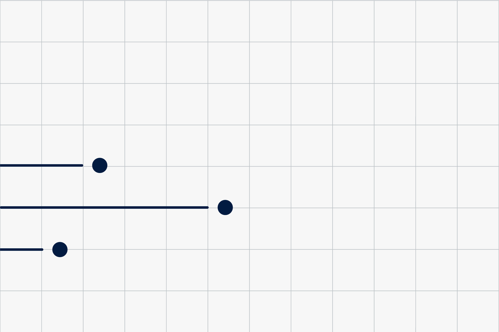
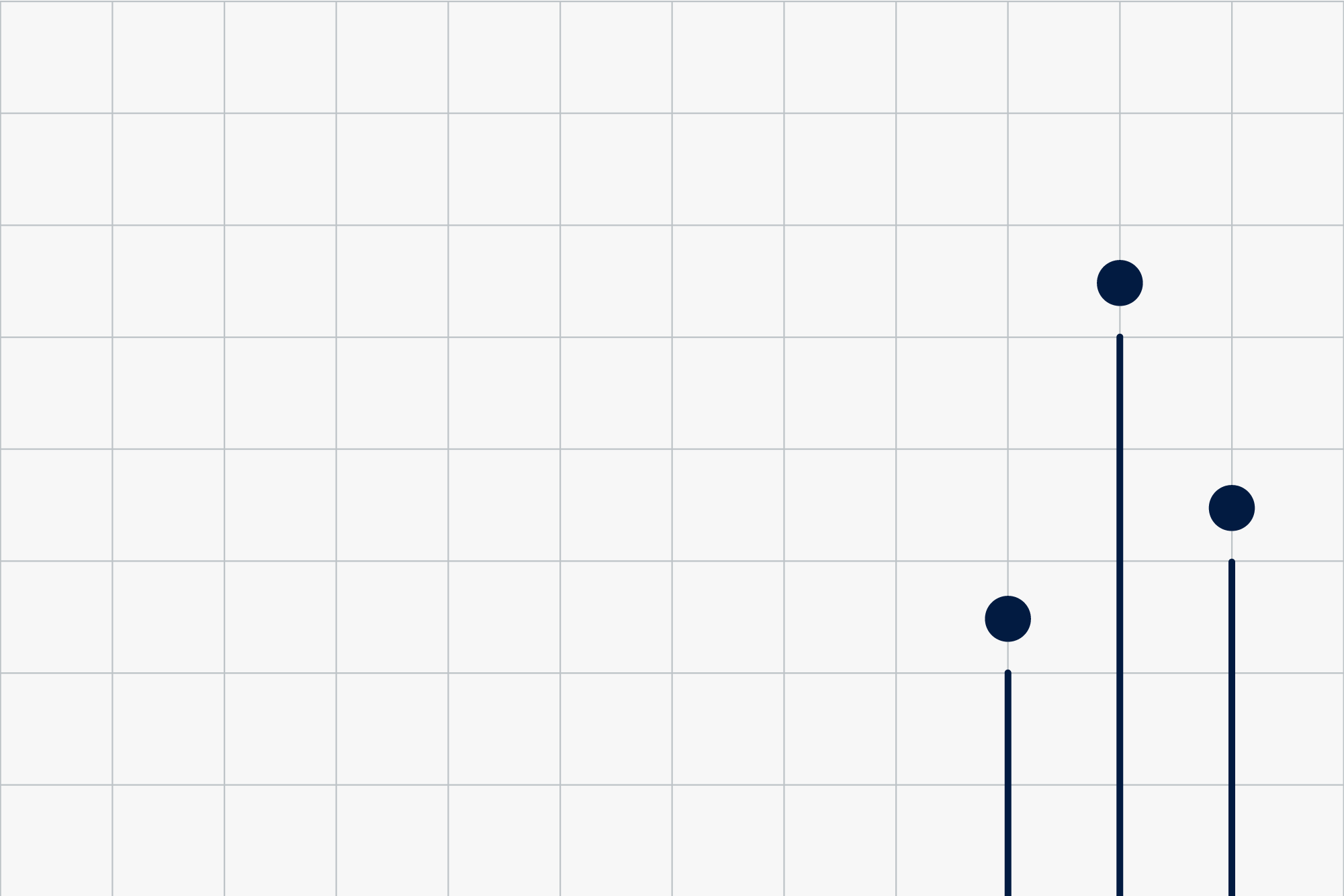
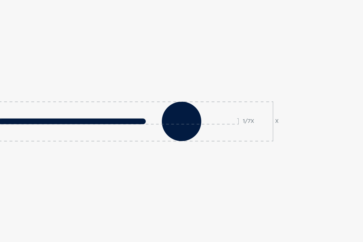
To keep consistency in this asset throughout different dimensions and sizes, we use 1/7th of the dot’s diameter for the width of the line.
Our visual style in use.

Updated 2022/04/27
Branded iconography is inspired by the visual style of the logo. These icons are made for informational purpose, not for communicating brand or benefits.
To create a new icon in line with our iconset, we use a minimalistic line-based style. We intercept the lines in our icons so they resemble our visual style and complete our visual language.

Updated 2026/03/31
Illustrations make our communication recognizable and help illustrate different topics and themes.
They belong to the distinctive assets of our brand as well as logo, font or color scheme.

A system based on scaling from small iconography to complex illustrations of Innovatrics products ensures consistency and continuity throughout the whole illustration style.

Illustration as iconography is created by a line intercepted with empty space or a dot. For better legibility, the icon is set in a circular object.

The illustration uses multiple intercepted rounded lines with three dots incorporated in the image. For the background we use the brands three dots.

The illustration changes into an isometric visualisation. We also add gradient surfaces to create a more solid object. For the background we use the brands three dots or no supporting element.

The illustration is isometric. The gradient shapes are more complex and there is a dynamic layer added through the use of dotted lines ina different width and lentgh.
Each market is represented by a custom illustration based on the rules mentioned above. Each illustration bears the color scheme of the solution they represent.


Updated 2022/04/27
Bringing motion to our illustrative style enhances the progressive essence of our brand.

The animation uses our three dots as dynamic moving elements. By moving in different directions the image is gradually formed around them.
The image starts to form gradually (from top to bottom). At first we only see the 3 points. Then the points create lines. Finally the gradient surface appears and forms and a complex image appears.


Updated 2022/04/27
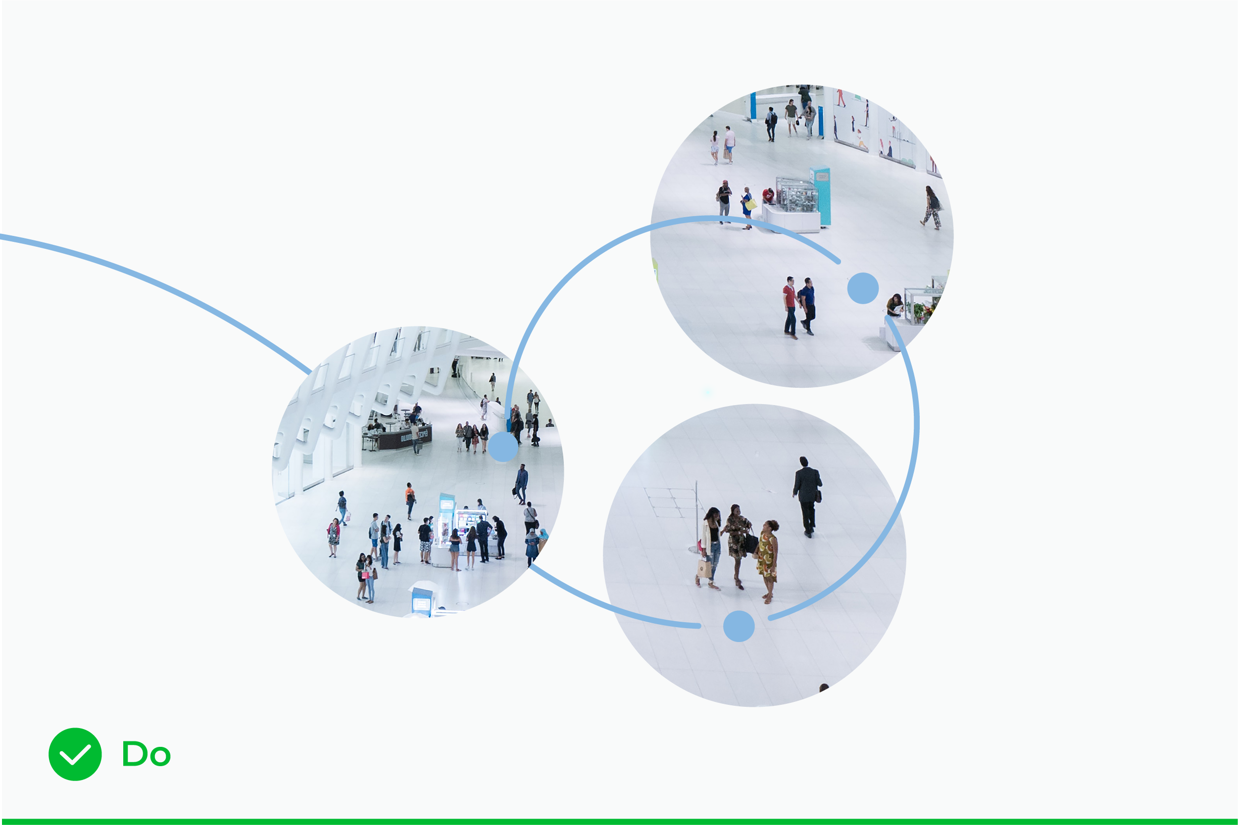
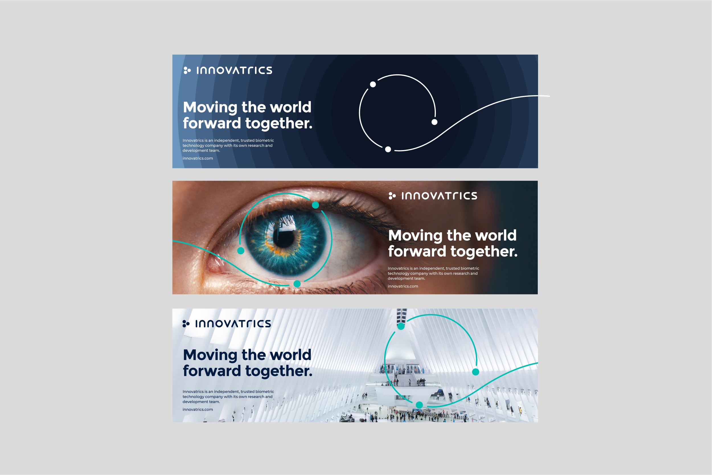
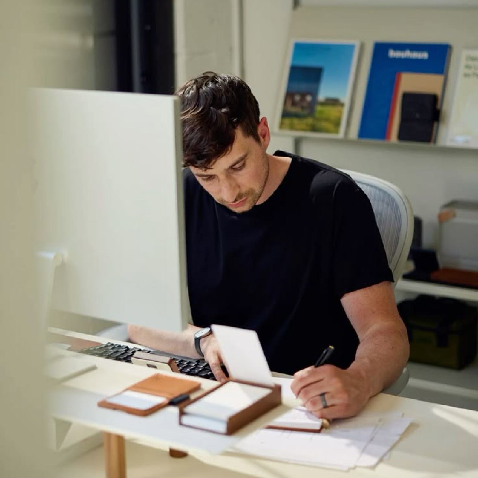
We want to create authentic imagery that portrays the world of instant trust. Trust between technology and the user. To better illustrate the complexity and diverse use of our solutions, we focus on using photography style that represents the near future. Our brand is progressive and our photography should reinforce these values.

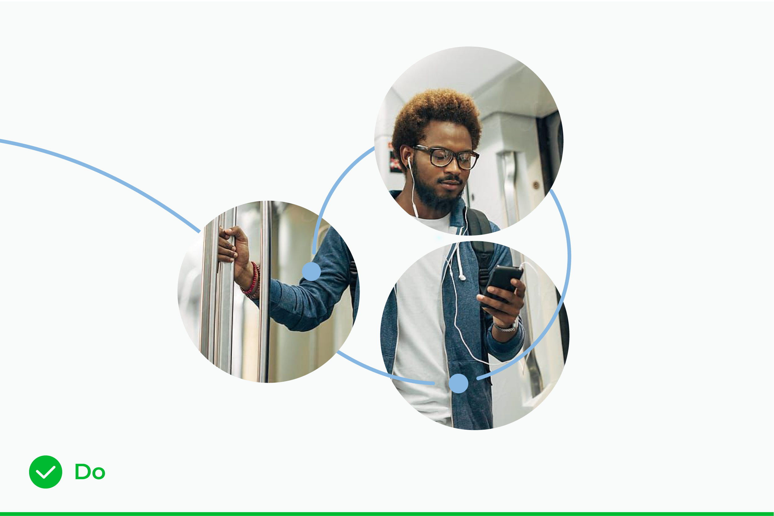
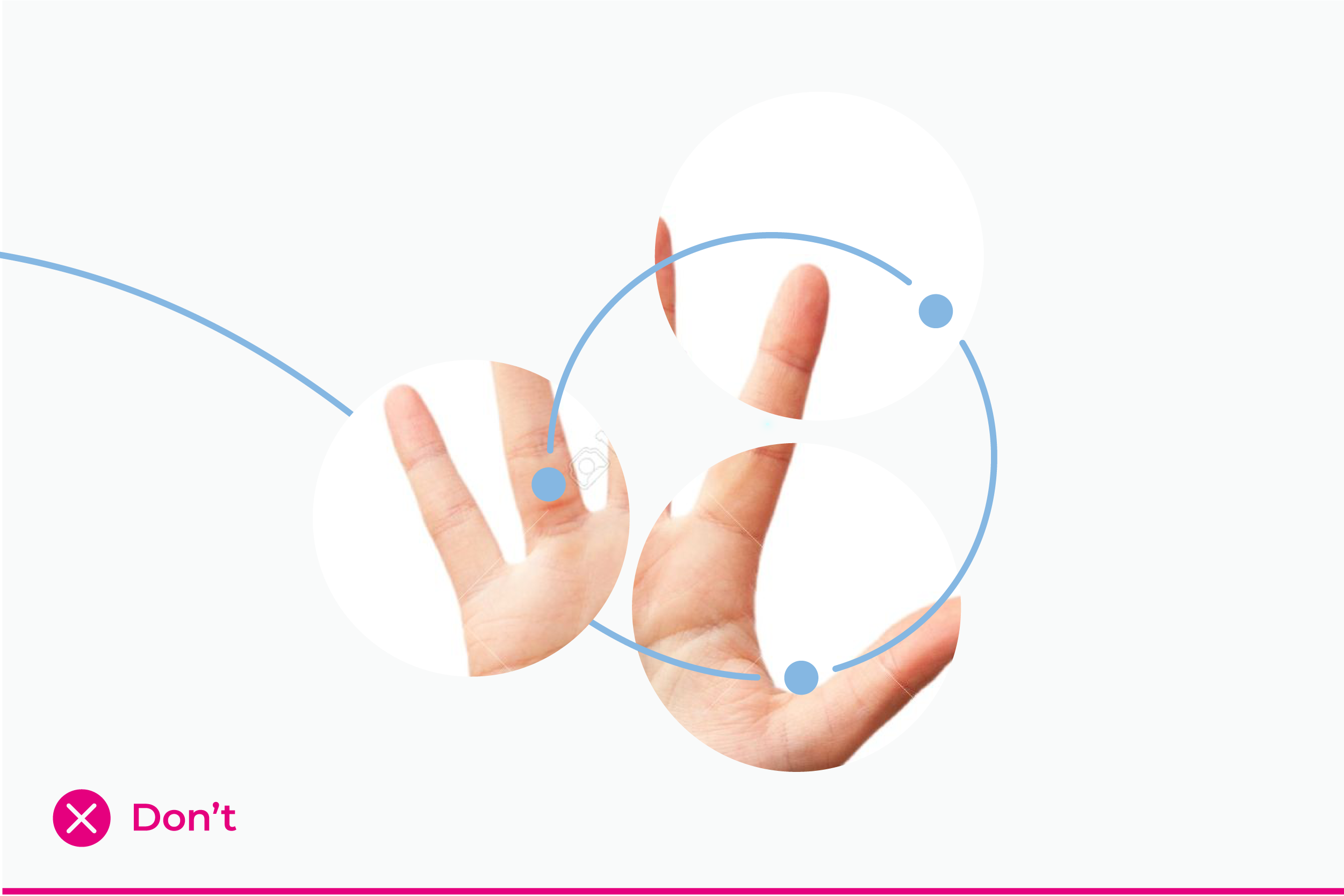
On promotional covers like business materials (e.g. e-book, whitepaper, case study,…) and social media, we use photography in circle mask.
The mask consists of three circular cutouts intertwined with our brand spiral element. The dots in the spiral are always present on top of the cutout masks. The line, which is coming from out of format, is always underneath one circlular cutout.
When using circle masks, we look for photographs showing:
Updated 2023/02/10
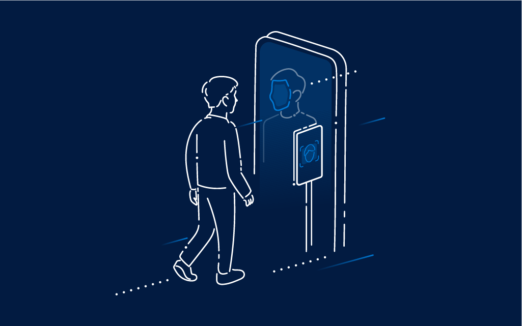
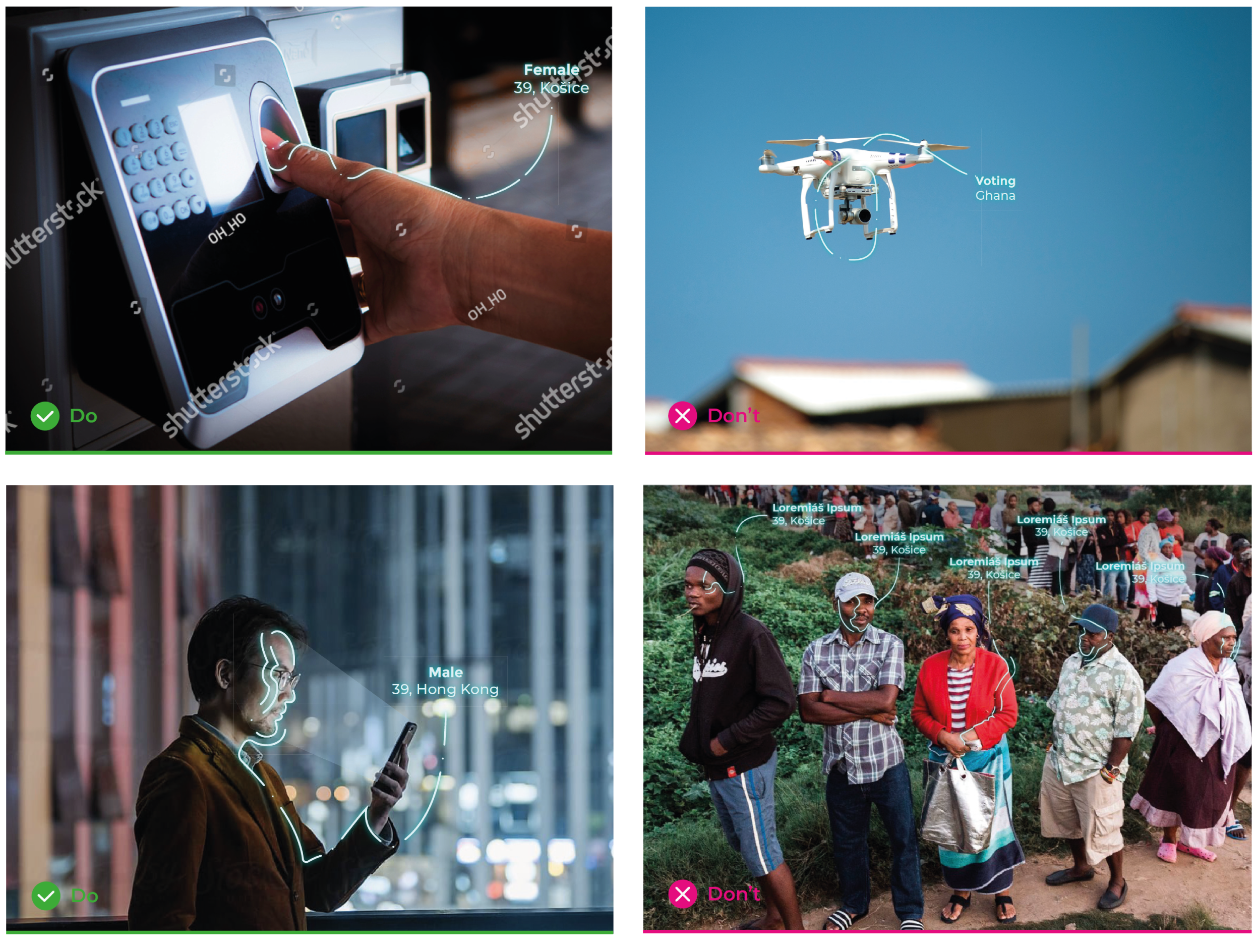
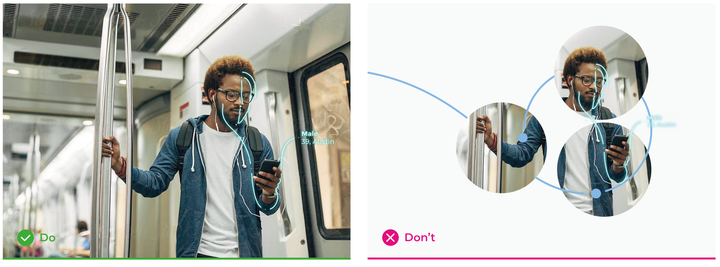
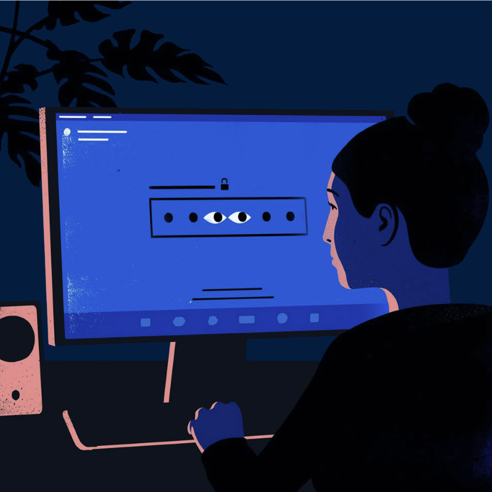
This authentic visual approach for visualising the biometric technology is unique and custom fitted for Innovatrics. Our style is organic, curvy and brings out the human aspect in our technical product.

When visualising biometry on photographs, we always show a person using a certain technology. With this approach, we create a connection between the user and the device, that feels intimate rather than invasive or alien.
To keep the intimacy of the image, it is best to use:

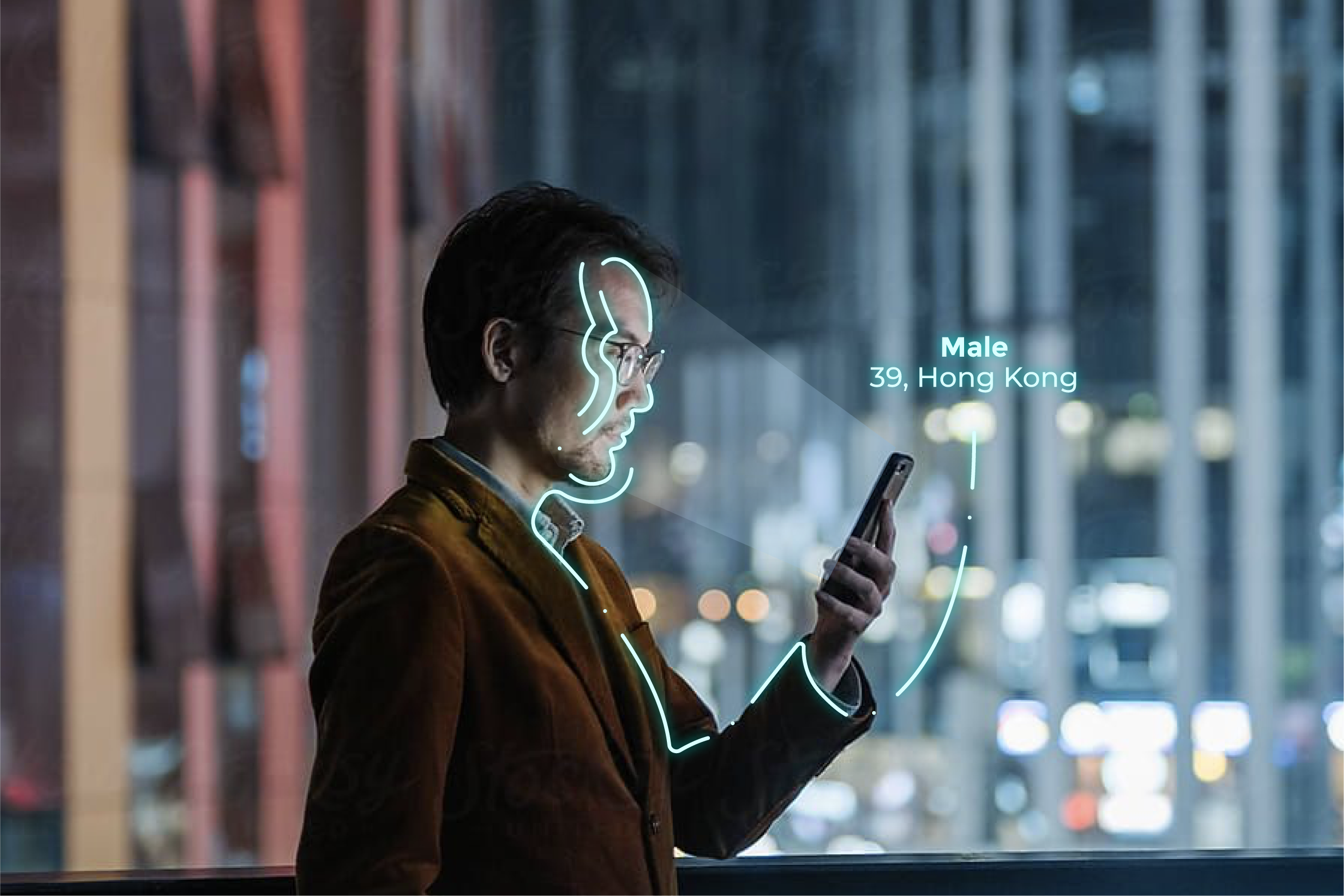
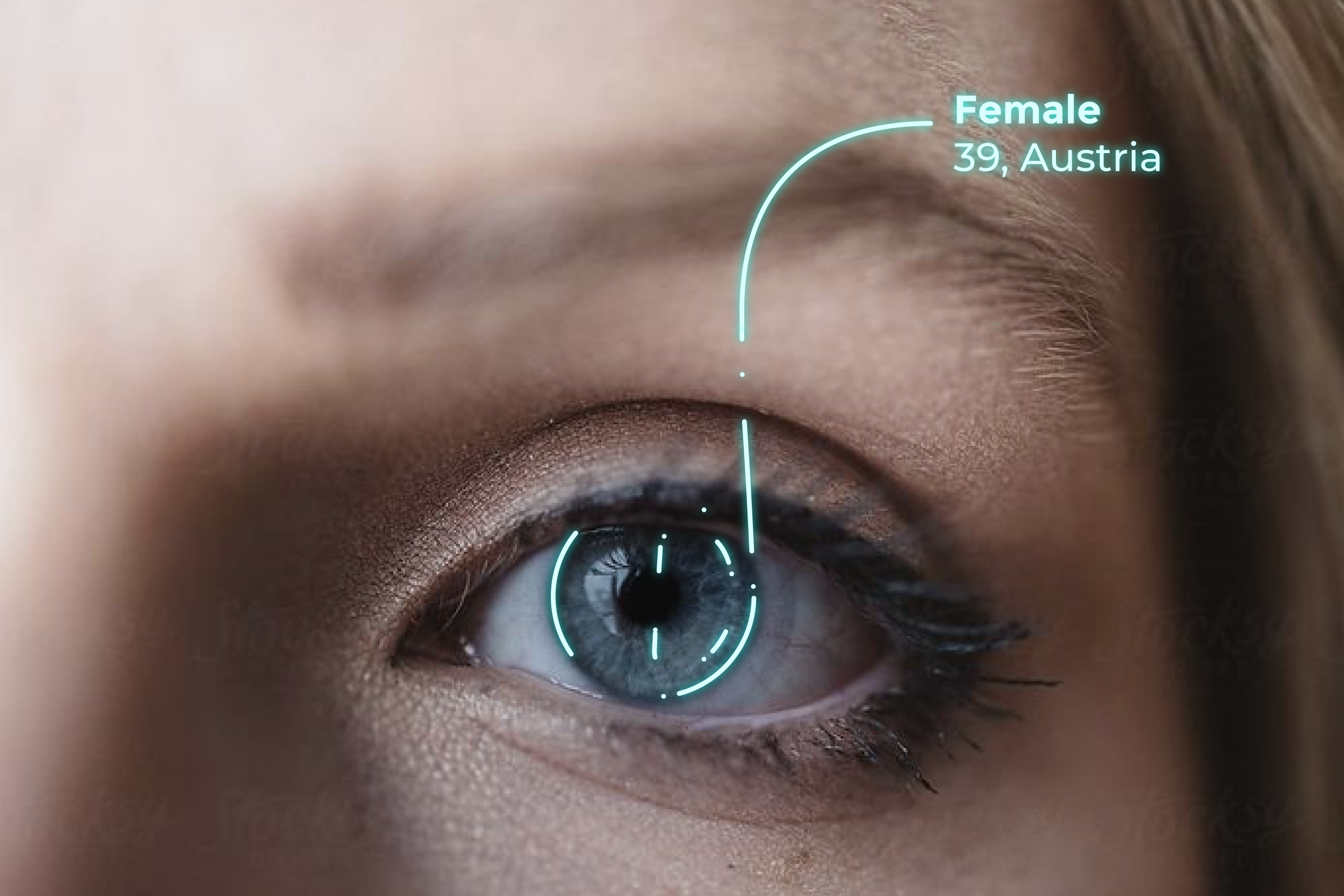
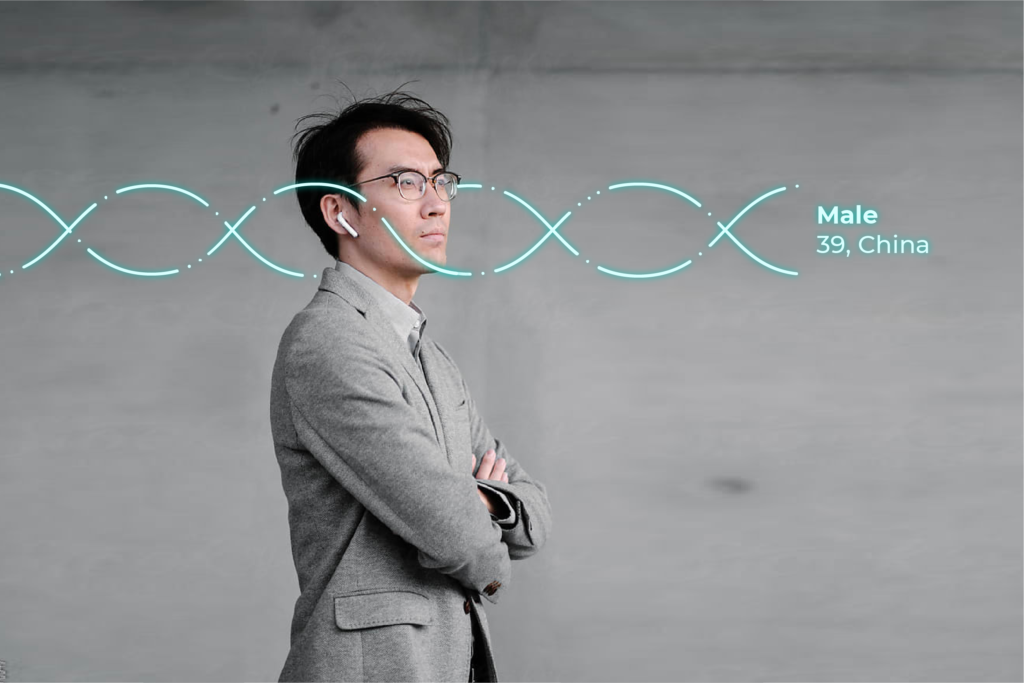

To create a more humane feel the system is composed of organic curvy lines intercepted by dots. To support the near-future aspect we use glow effect and show basic data (sex, age, origin, etc.).
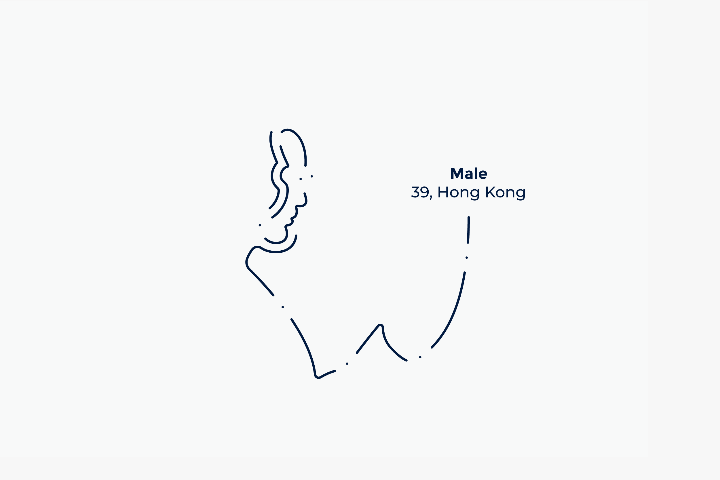
Line color: Light Blue
Glow color: Aqua
Glow blur: 5 px, 100% opacity
Line width: optically similar to the weight of Montserrat Bold letter “i”
Type size and line spacing: 25 pt/27 pt (when picture height is 900 px)

RGB — 217 255 255
CMYK — 16 0 4 0
HEX — D9FFFF

RGB — 0 191 178
CMYK — 81 0 40 0
HEX — 00BFB2
Updated 2026/04/01
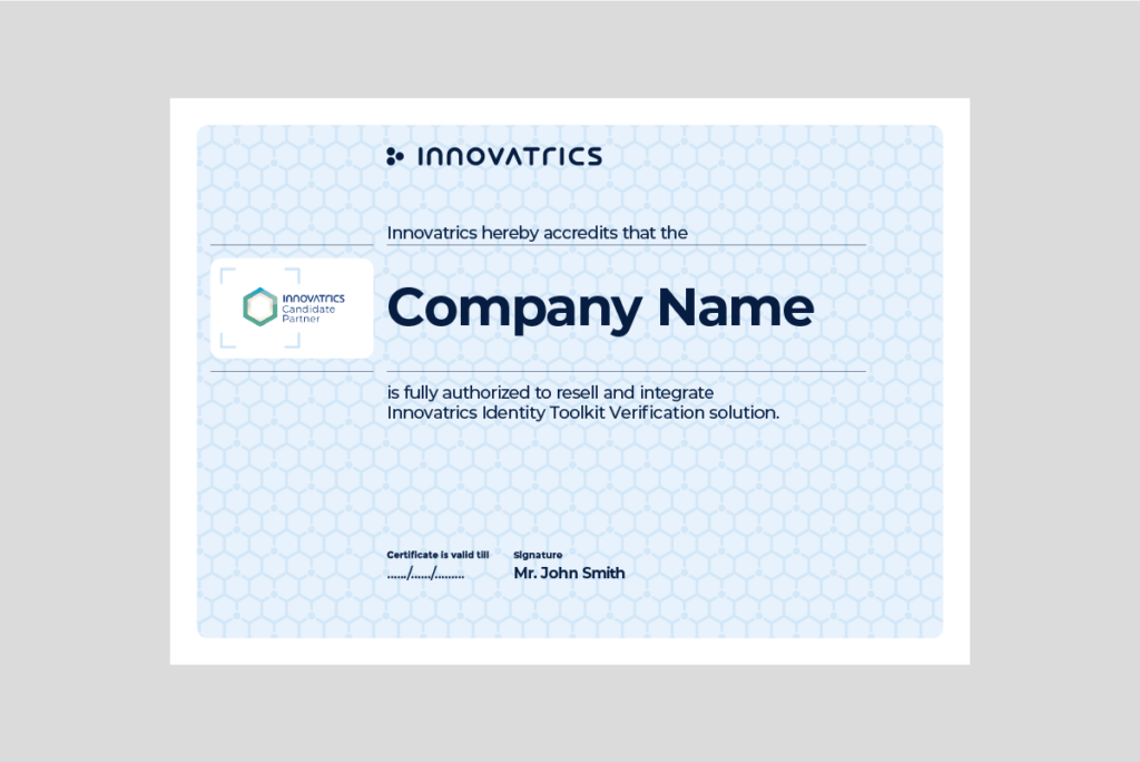
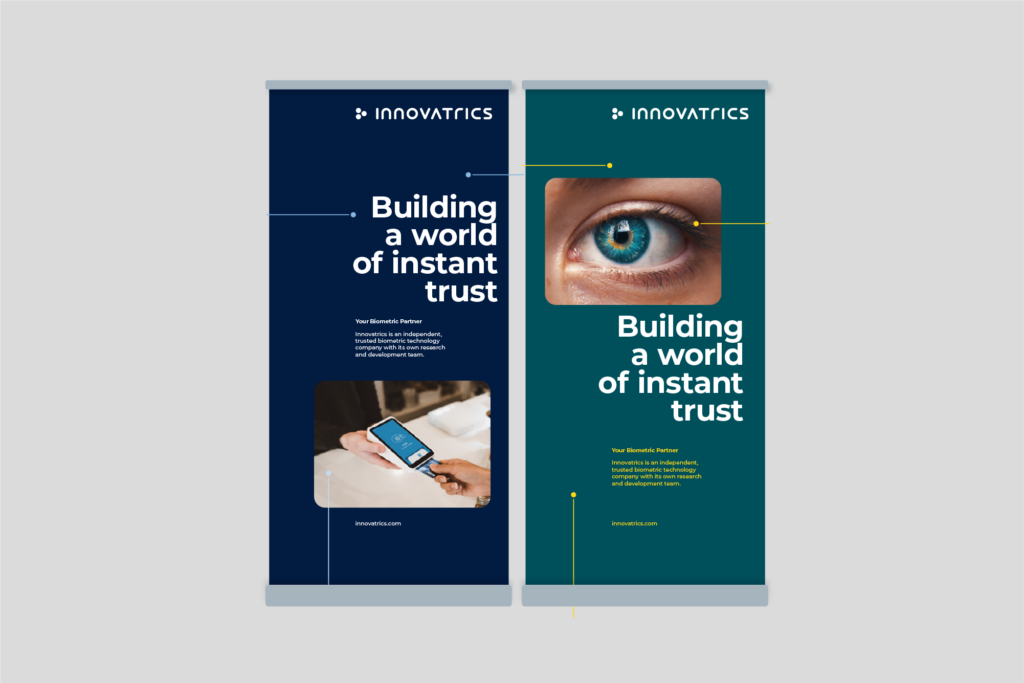
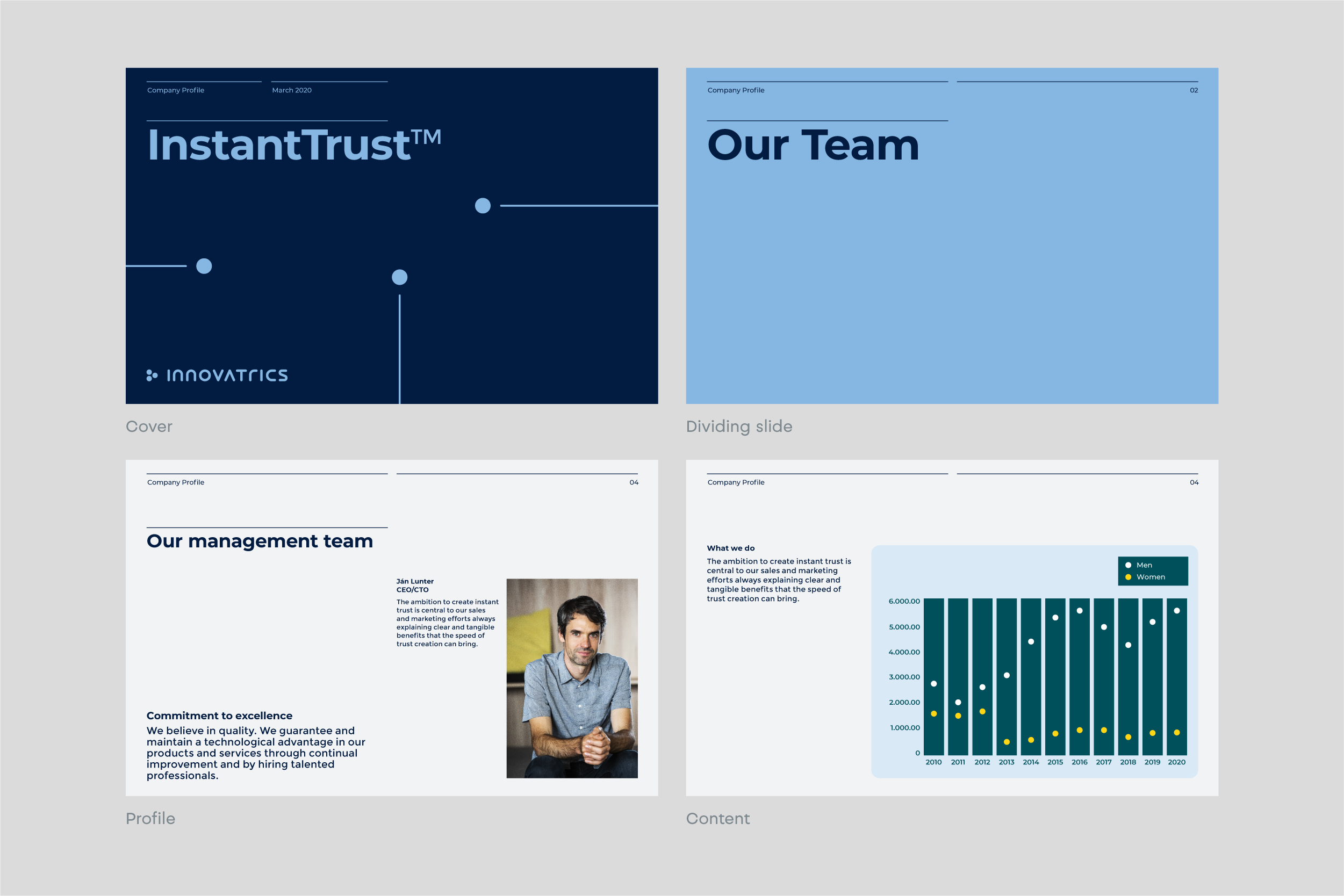
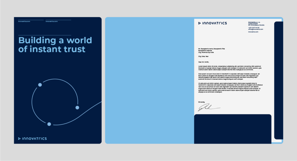
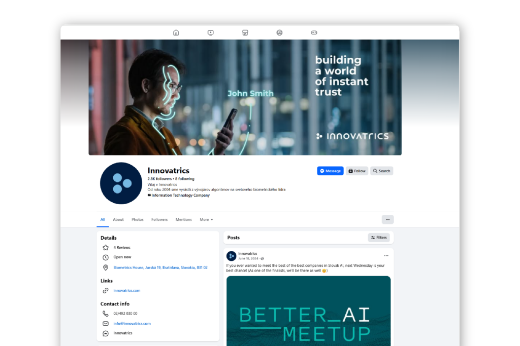
This section demonstrates how the visual elements work together and shows how each element should be applied.
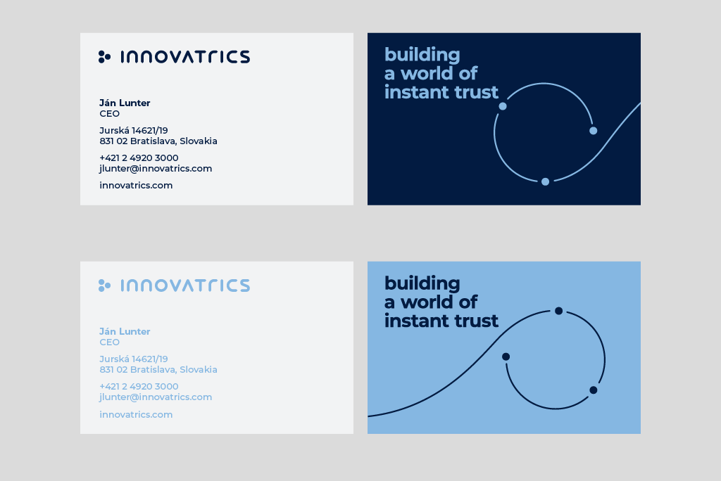
The size is set to size of 85 x 55 mm. The color combination for our main business card is dark blue. For different company departments, we can use different colors of the business cards.


The open-source ppt presentation template can be found on this link.

We are showing you three options of how to work with visual identity:

Updated 2026/04/10

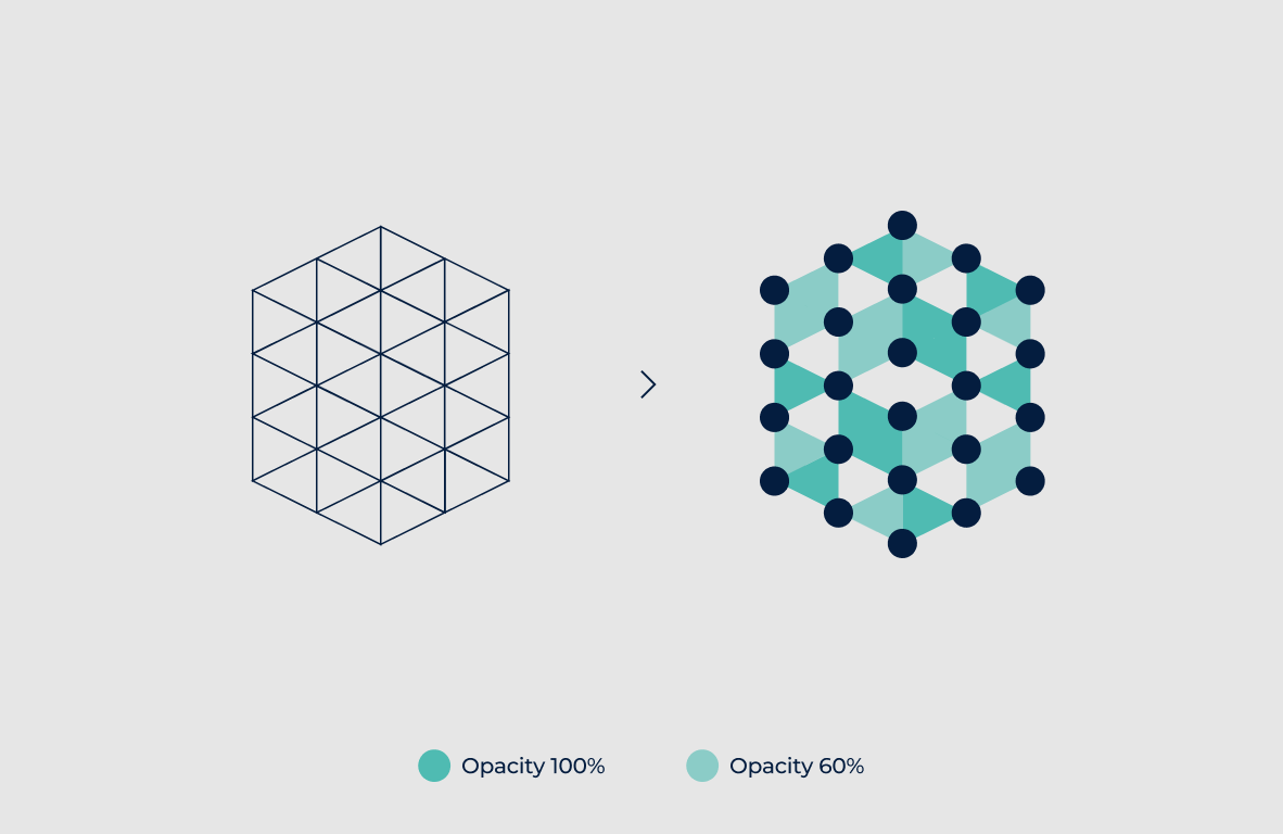
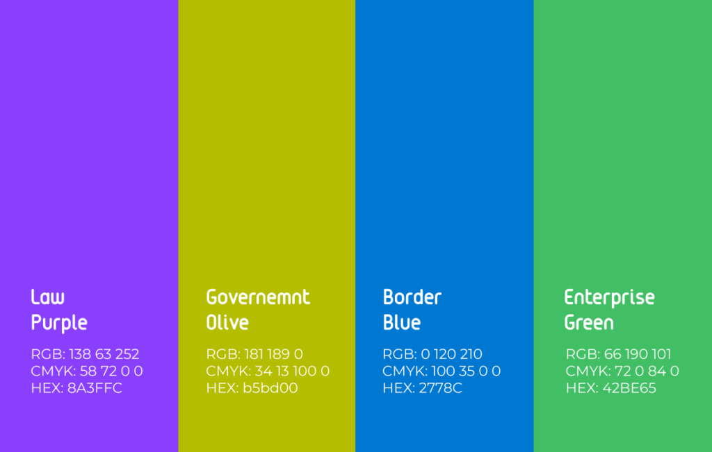
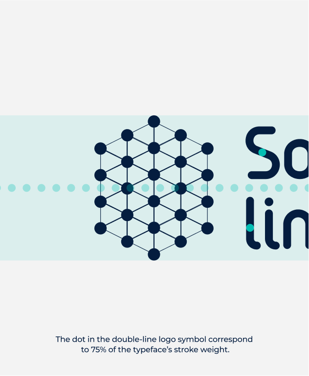
Technology symbols are constructed using a polygon symbol grid. They are built from triangular shapes and use either the base Aqua color or a color associated with a specific market segment. Colors are applied at 100% and 60% opacity to create the required shades.
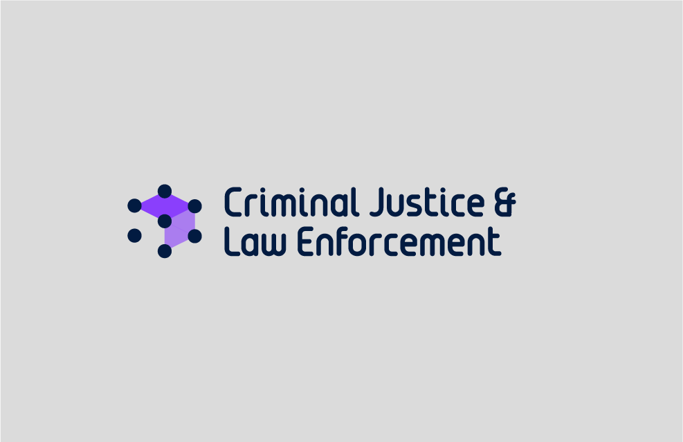
Market segments are distinguished by color and use custom typography. Tags can be used in their compact form or as full tags. They must not be combined with solution logos and should be placed separately on the layout.


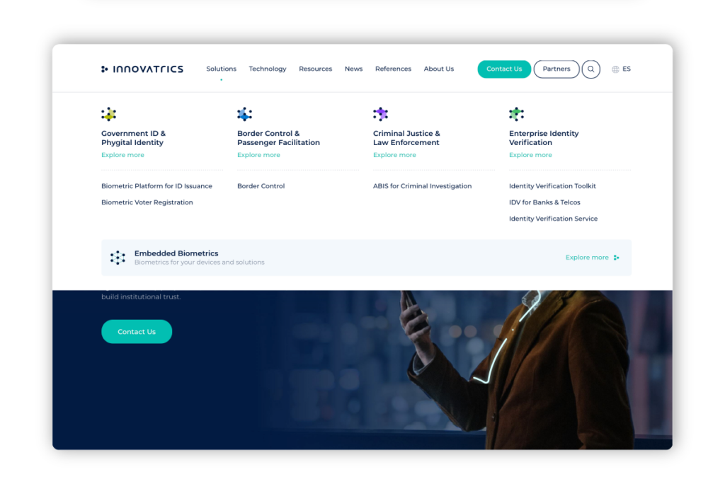
Solutions connected to a market segment adopt its color in the symbol and use the custom typeface in their logotype.

The Aqua color is used for technology types in menu logos. When a technology is linked to a market, it adopts the market’s color.
The custom typeface is based on a previously used font from earlier logotypes. It has been updated, refined, and expanded into a basic character set. It is used exclusively for product logotypes—both new and existing—to maintain a cohesive visual identity.
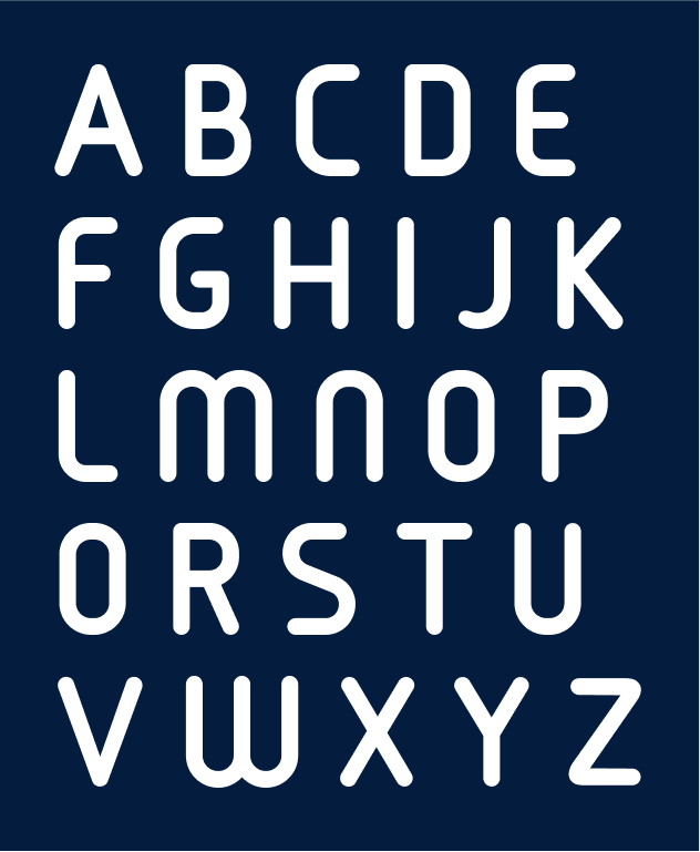

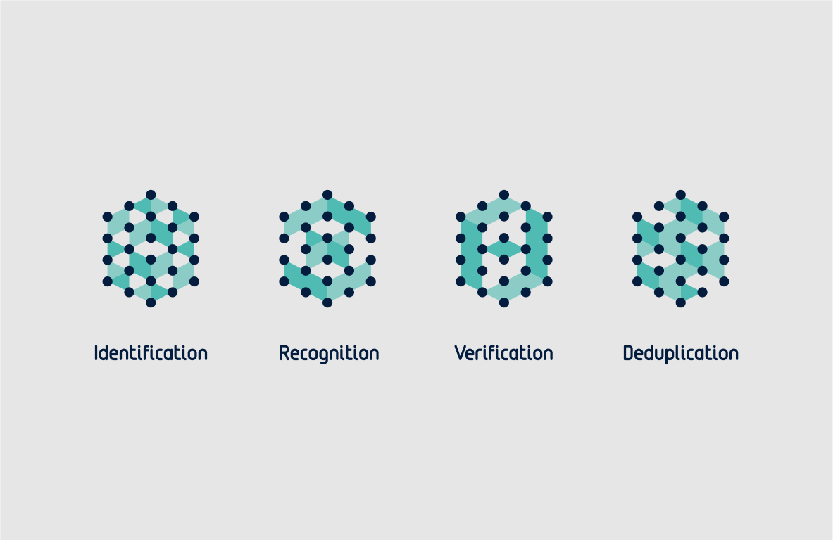
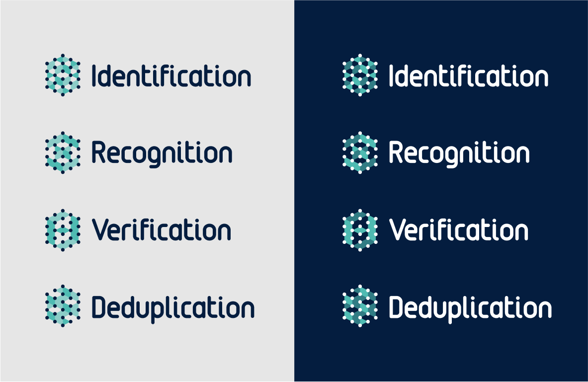
The solution symbol is constructed using a hexagonal grid and adopts the appropriate market segment color. Logos use only the custom typeface to ensure a cohesive visual language.

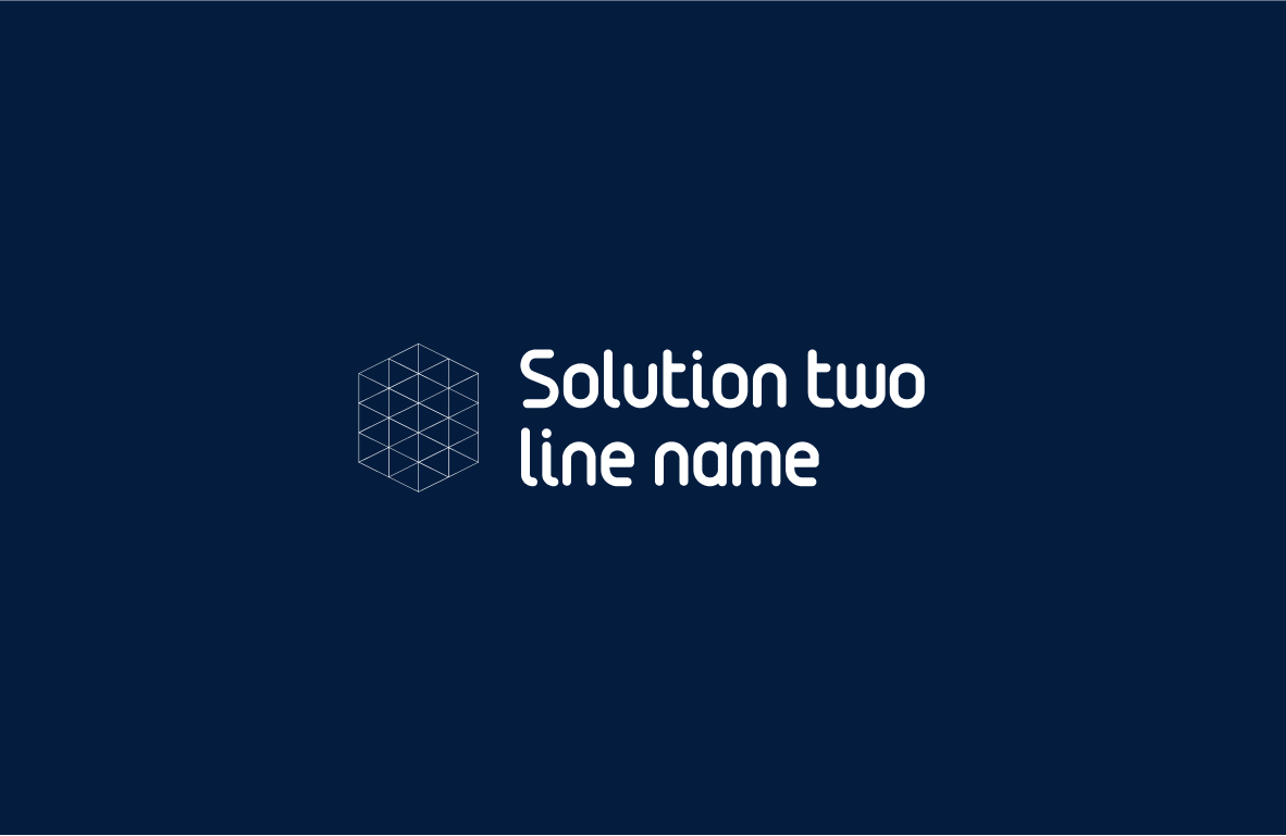

The solution name is placed one-third of the symbol’s width away from the symbol.

The logo safe zone is half of the symbol’s width, and no elements should be placed within this area.
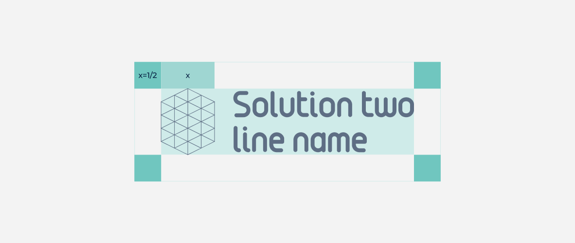
The minimum logo size for online use is 80 px, and for print, it is 12 mm. These sizes must not be reduced, as doing so compromises legibility.


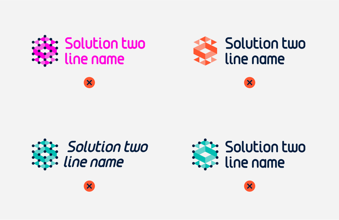
It is prohibited to change the logotype’s color, modify any of its parts, distort its shape, or remove any of its elements.
Photos should appear authentic—less like stock images or AI-generated visuals. They should use the brand’s color palette and feature genuine-looking people. Additional photos may show realistic details of technologies used by or connected to the brand. Illustrations must be original and maintain a cohesive appearance using the brand’s color palette.


Case studies and proposal documents must follow the correct information hierarchy to improve readability and include either photography or illustration.

Updated 2022/04/22
It is important, that our brand grows and our branding grows with it systematically. And so, to create a branding for our deparments, we advise to follow the rules below to keep consistency.
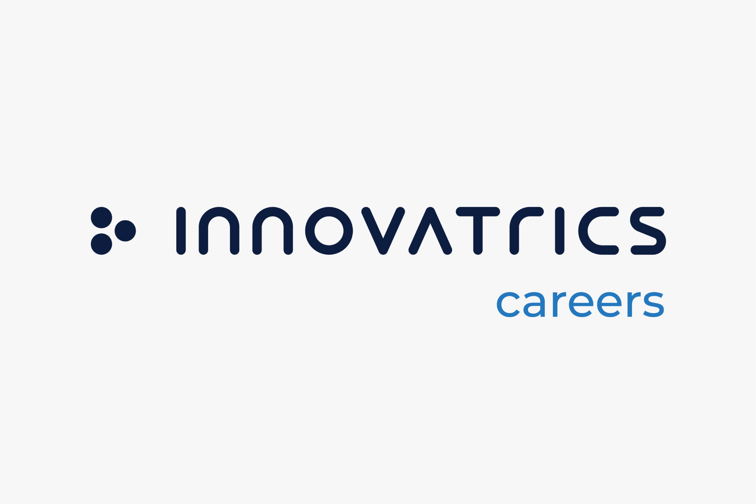
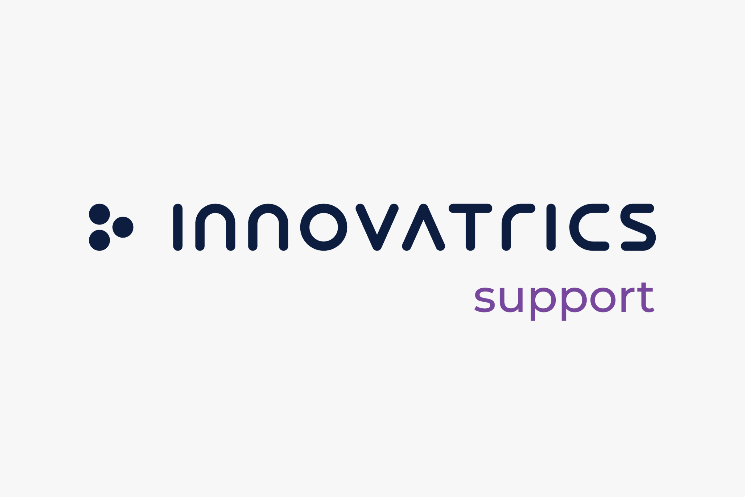
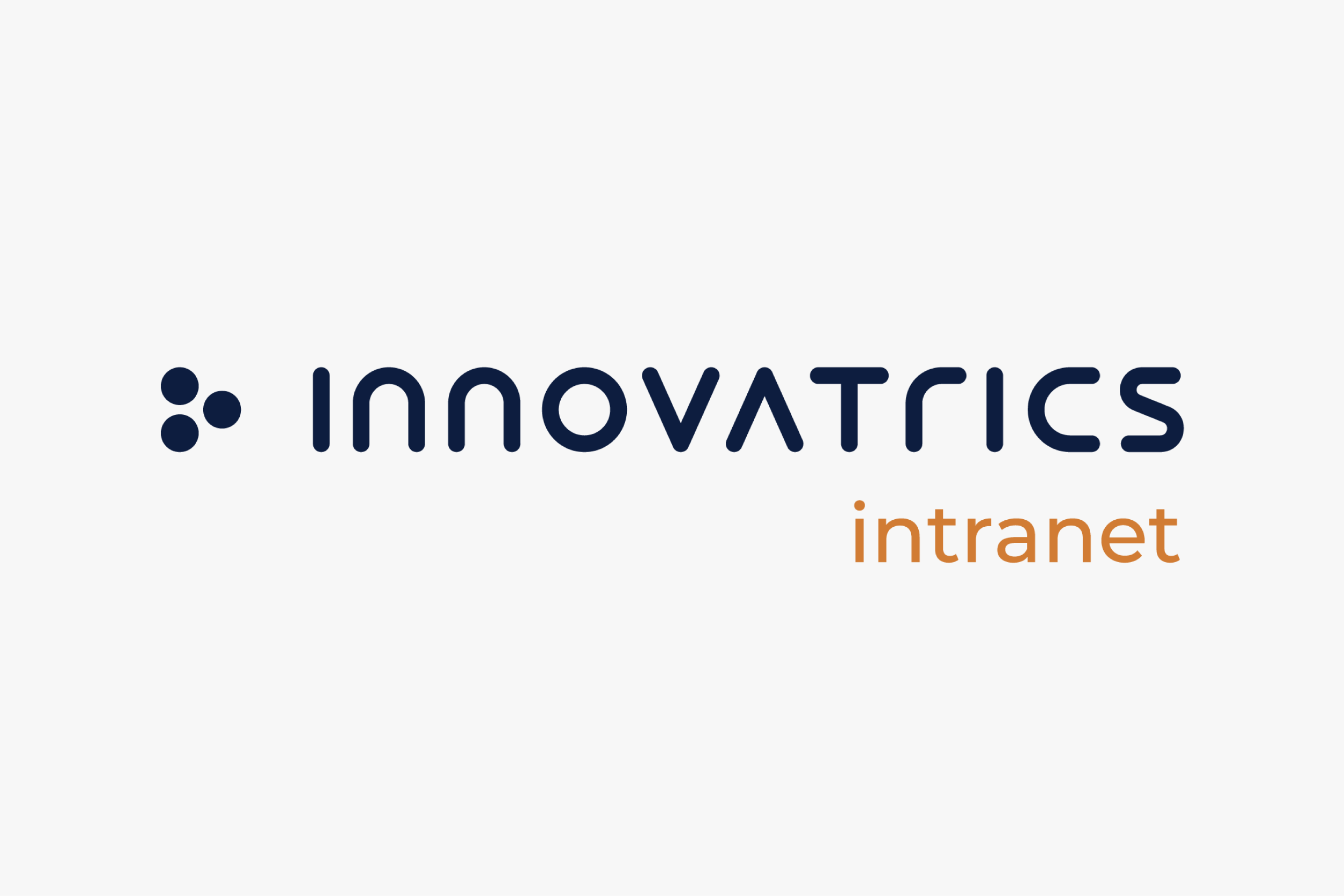
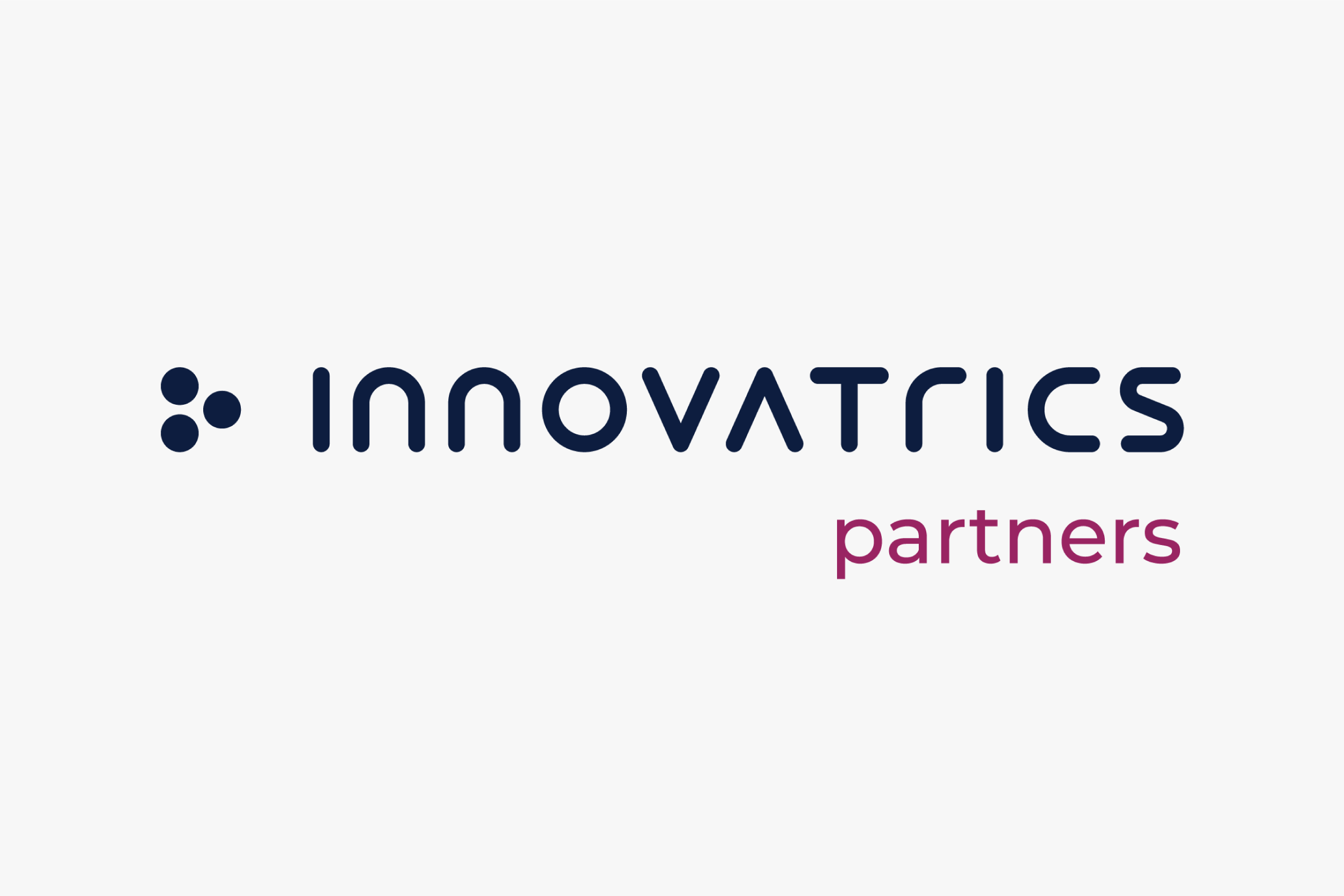
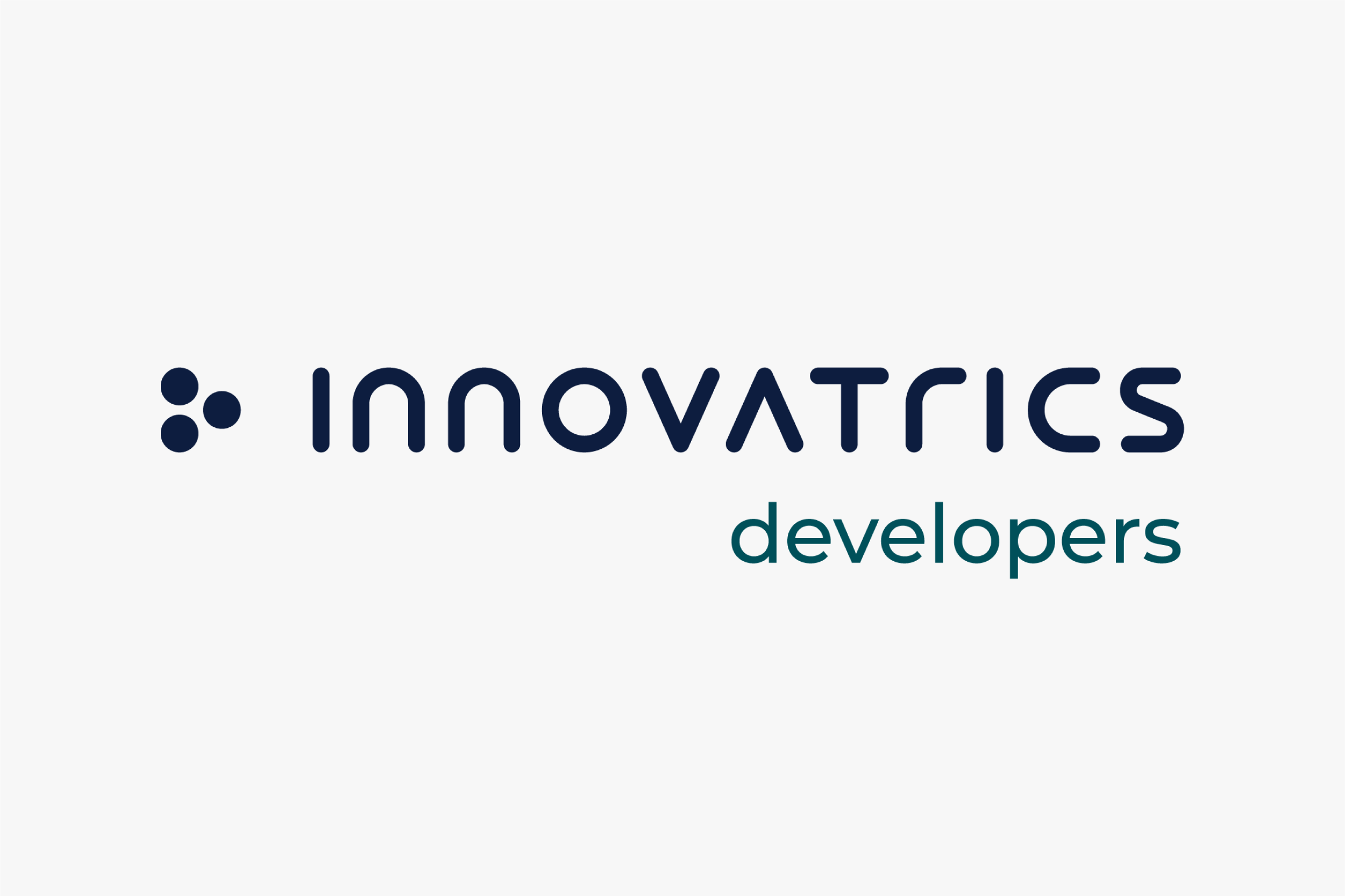

To create department names, we use our brand typeface Montserrat (Medium).
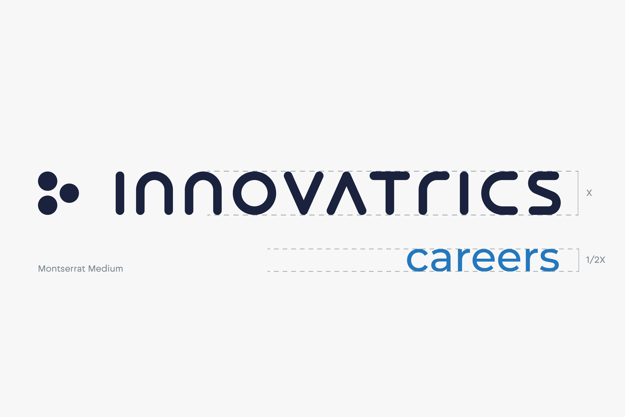
To ensure the logic of the releationship between the motherbrand (Innovatrics) and its subbrand (careers), we keep the proportions as described above.
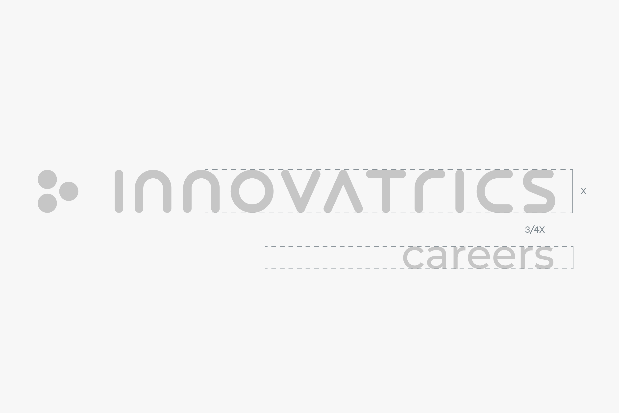
The distance between the two objects should stay 3/4 the size of the logo.
Every department has a specific color for better navigation and clear division. We use vibrant accent colors from our brand palette (see here) to constrast our signature dark blue color.
Updated 2026/04/10